This Bishan maisonette makes room for music, art and family
description
For around two decades, this maisonette in Bishan had barely been touched. The interiors, finishes and services were dated by the time the owners – a young family with a toddler and their helper – took it on, and the layout no longer suited the way they wanted to live.
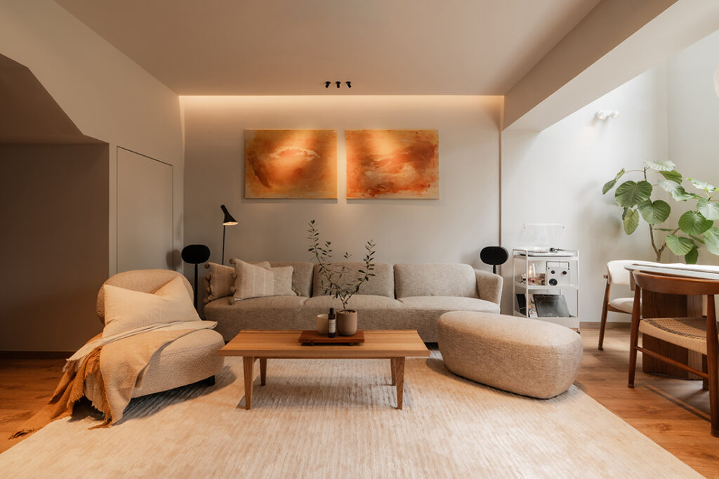
Design studio typeface stripped it back almost entirely, keeping the existing structure as the framework. “The approach was less about preserving individual finishes than about giving the existing home a new way of functioning, while making the most of its generous volume, natural light and connection to the surrounding greenery,” explains lead designer Rei Ye.
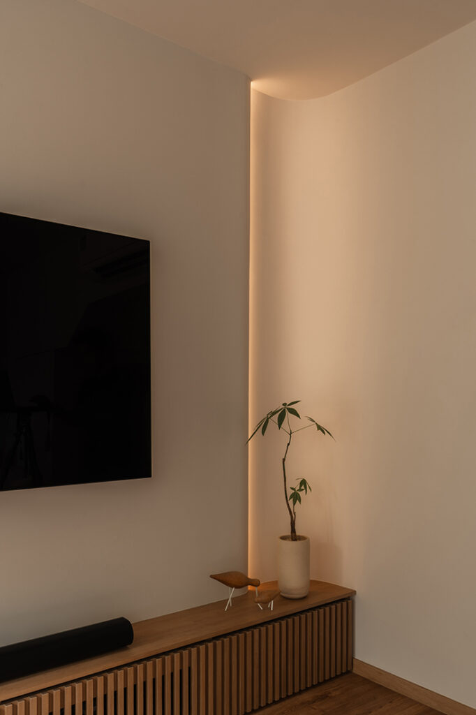
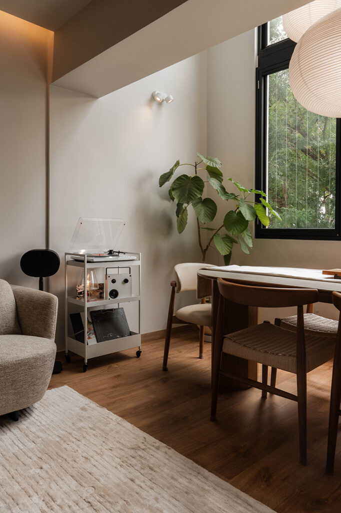
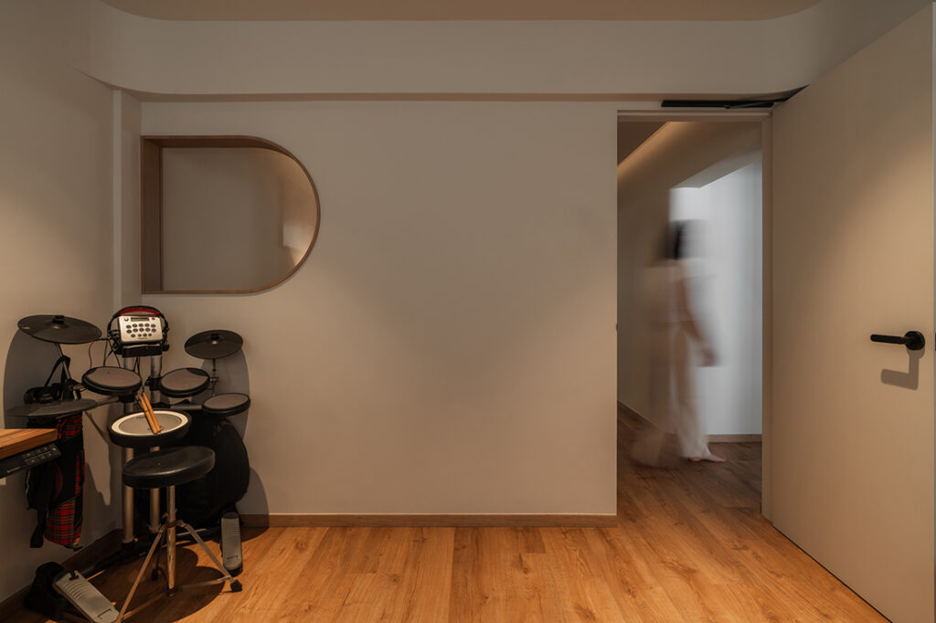
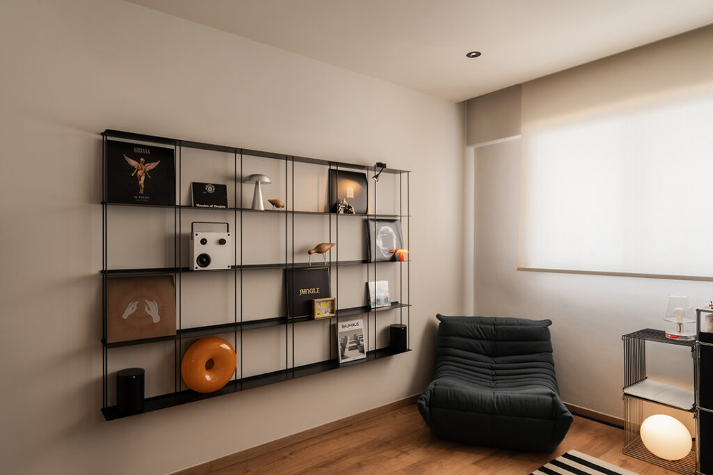
The husband works in shipping and has a real appetite for collecting: vinyl, pop art and objects with character, from USM’s modular furniture to a Ligne Roset Togo. He also plays the drums and follows motorsport. His wife prefers things quieter and unwinds at home with her favourite shows, so the shared spaces had to stay comfortable and understated but still give his interests somewhere to go. The brief was for a home that felt warm and personal, somewhere they could switch off and have people over rather than another generic, highly finished interior – open and breathable, but private where it needs to be.
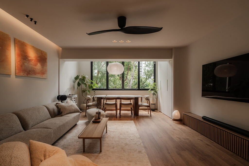
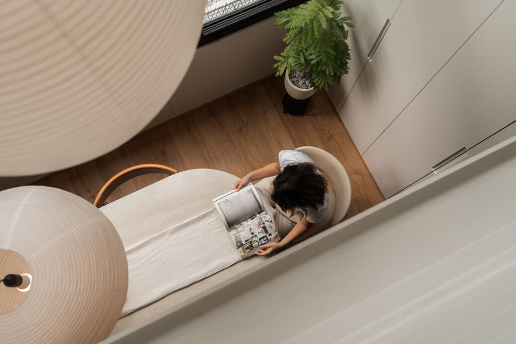
On the lower floor, living and dining were opened up into one sociable stretch, with furniture and mood doing the dividing, not walls. “Rather than treating the balcony as a separate outdoor area, we integrated it into the living experience and relocated the main dining area there,” says Rei. “It lets the family enjoy the greenery and park views, while making the living space feel more expansive.” The table now sits close to the window, so the trees outside become the view. HAY paper pendants hang above it, their translucent shades softening the light.
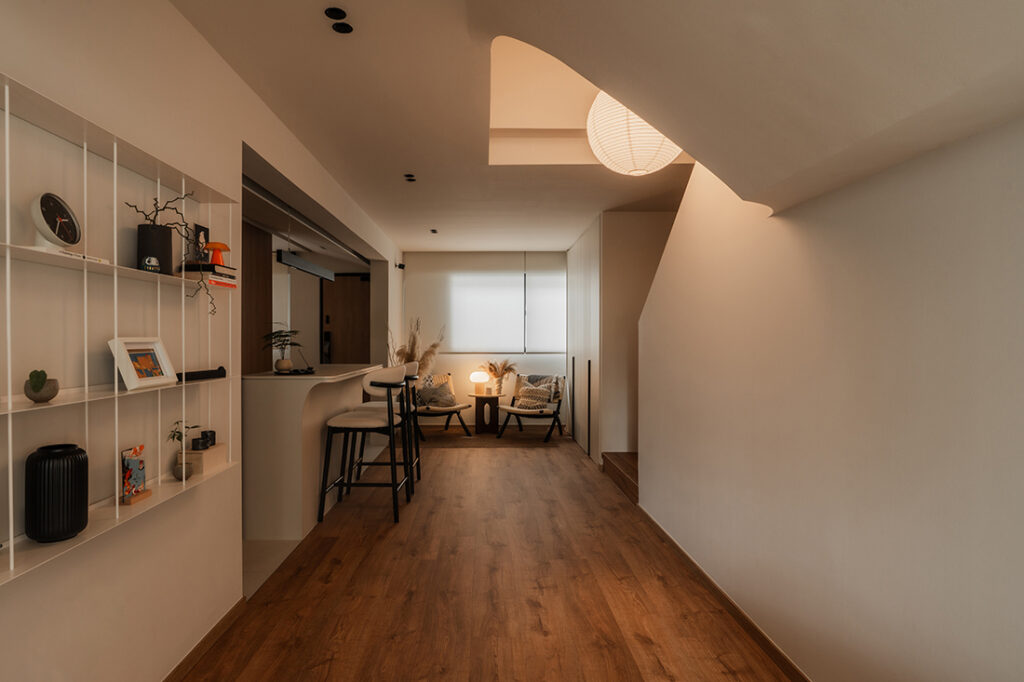
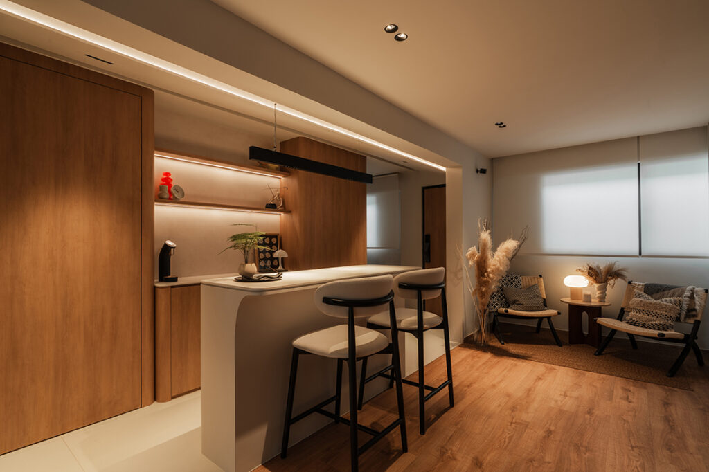
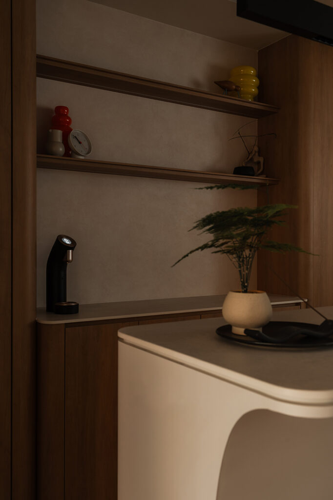
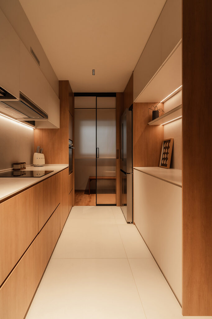
They cook often, and the wife wanted an island and a pantry without the working kitchen in full view. The original long, enclosed kitchen was split into a back-to-back arrangement: the dry side and island facing the living areas, with the wet kitchen tucked behind. The island’s rounded edges take the hard lines out of a fairly straight plan, and it is where everyone naturally gathers. A double-door connection links entrance, pantry and kitchen, closing off the working end when needed, and a fluted glass sliding door between the wet kitchen and foyer lets light through without putting the space on show.
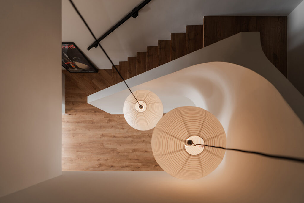
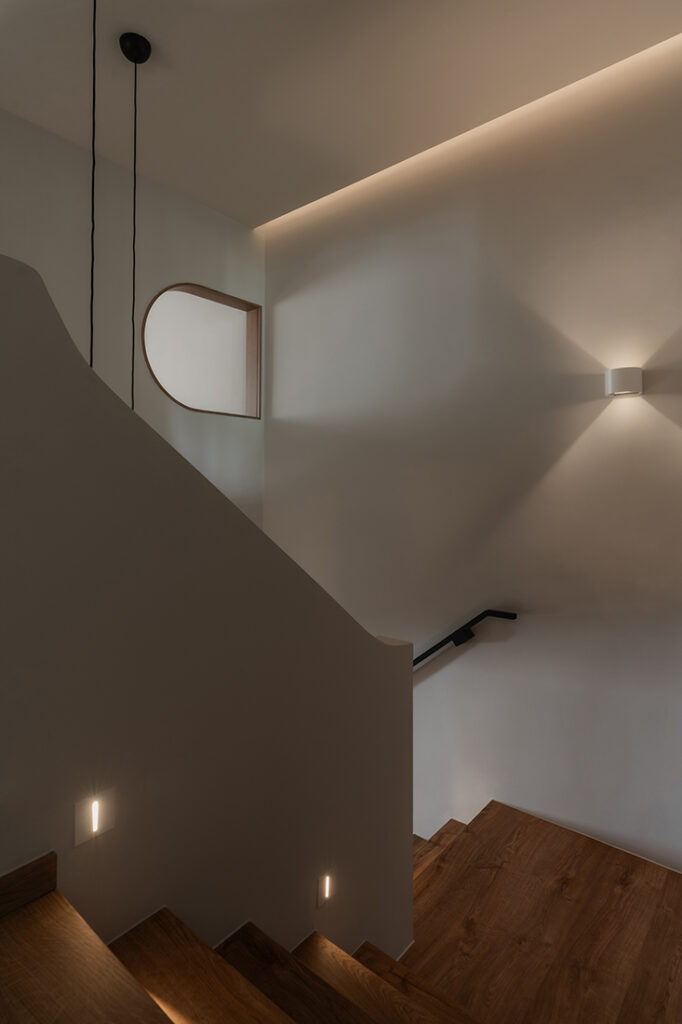
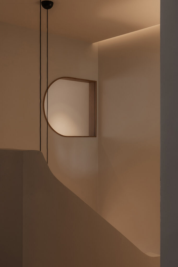
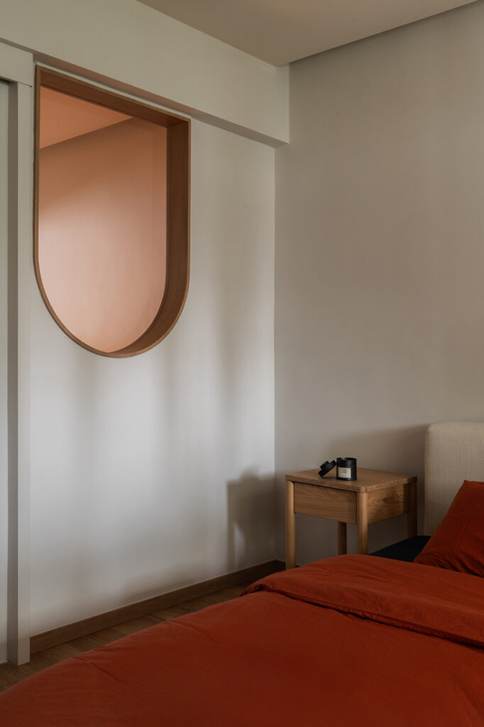
The designers extended and reworked the original staircase so that moving between the two floors feels more inviting. The old railing was clad over to form one continuous, sculptural balustrade. Window-like portals were introduced between the stairwell and the bedrooms, including the master and the husband’s man cave. They pull daylight into the stairwell and open up glimpses from the private rooms to the stair, so the two floors feel less boxed off from one another. Hidden lighting runs along the upper edge, and low-level lights pick out the steps.
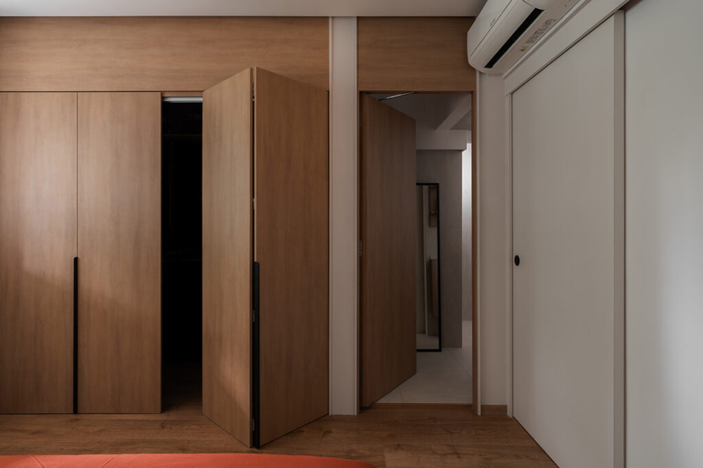
In the master bedroom, the bed faces the bathroom, so its door was made to match the surrounding timber cabinetry and all but disappears when shut. Storage was treated the same way. The maisonette has no household shelter, so it all had to be worked in elsewhere. “We integrated it discreetly into the architecture and joinery, so the functional requirements recede into the background instead of visually dominating the home,” says Rei.
Only the man cave breaks from all this. Black and white takes over from the softer tones of the shared rooms, and a wall of Kriptonite Krossing shelving puts his records, books and memorabilia on show instead of shut away.
Directly opposite the block is a neighbourhood park. The parents can watch from indoors as their toddler goes there on regular walks with her kindergarten – a small everyday thing that became part of the home’s sense of place.
typeface
www.typeface.works
www.instagram.com/__typeface
Photography by Human + Space
We think you may also like The joy of hosting in a maisonette
DETAILS
PROJECT GALLERY
PROJECT GALLERY
Living Room
Dining Room

Kitchen
Staircase
Bedroom
Bathroom