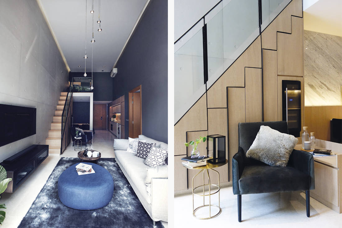
A sophisticated bachelor pad is created by tastefully amalgamating subtle texture, clean-lined details and mellow tones.
25 January 2019
Home Type: 1-bedroom + study condominium apartment
Floor Area: 650sqft
Text by Louisa Clare Lim
Photography by Beng Wooi (courtesy of Satobent Interior Design)

Any hip 30-something-year-old bachelor would be proud to call this sophisticated loft-style apartment home. Renovated for around $105,000 by Mr. Amin of Satobent Interior Design, homeowner Mervyn Tay’s centrally located apartment sports a masculine and contemporary Italian-inspired design, with a touch of industrial style.

A palette of medium and dark wood tones, as well as shades of black and warm grey, gives the home mood, while the use of natural materials such as marble, timber and cement sets the edgy-meets-modern-luxe tone of the interiors. Concrete, in particular, was a texture that Mervyn specifically wanted as part of the home’s design. Installed in a grid, on one wall through the entire length of the apartment, panels from Concrete LCDA backdrop the open-concept five-metre-high living area. Juxtaposing the material’s rawness, a wall-mounted slab of polished Volakas marble jazzes up the cosy dining area that’s nestled beneath the mezzanine.

Next to the dining area is a compact one-wall kitchen, defined by its minimalist, linear form and contrasting colours. Positioned in the walkway leading into the main living space, it has been designed to be unobtrusive, with efficiency in mind, to blend into the long, narrow layout. Helping to zone the lounge area from the dining area, without breaking the visual flow of the spaces, a low built-in console was integrated as a perpendicular extension of the under-stairs cabinet. Not only does it provide additional storage space, it also disguises the column that supports the mezzanine by tying together the various horizontal and vertical elements, for a unified look.

In the bedroom, a platform was installed to distinguish the sleeping area next to the windows. Raised to take advantage of the ceiling height, and furnished with only the basics, the space is beautifully simple and exudes an inviting, calming vibe. As seen here, and also throughout the home, space is outlined and carved out by having both dropped and high ceilings – creating a balance between an airy and an intimate feel. As for furniture and fittings to complete the picture, pieces that balance style, comfort and functionality were selected, including designer ones from Living Divani and Studio Italia Design.
Inside Story
The bachelor homeowner shares more about his views on modern luxury and how he uses his space.
Which is your favourite space at home?
That would be my bedroom. Its cosiness lets me always look forward to getting a good night’s rest after a day’s work. The designer has also tactfully thought of a practical solution for increased storage in the room with a platform bed with concealed storage below!
What do you think makes your home feel luxurious and welcoming?
It’s very important that the loose furniture and decor pieces match the home’s overall design, to bring out its luxuriousness. The items do not have to be expensive, but have to be carefully chosen for its design properties.
What was your biggest splurge?
Although a large proportion of the renovation cost went into the bedroom, I splurged on the living room concrete feature wall. I have always loved the look and feel of raw concrete, especially in the designs of Japanese architect Tadao Ando. It was not easy finding the right concrete panels for the place, but I chanced upon Concrete LCDA and loved that real concrete is used to create the designs. Its authentic appearance definitely trumps the ubiquitous concrete-look tiles in the market.
What else would you have included in your reno wishlist?
If my home were a little bigger, perhaps a walk-in wardrobe would be something I would love to have!
This article first appeared on Lookbox Living #53 and the project was awarded Honourable Mention for Outstanding Private Apartment at Lookbox Design Awards 2017.
Satobent Interior Design
Instagram: satobent_interior
q@satobent.com
We think you may also like This 3-room HDB flat is both contemporary and nostalgic
Like what you just read? Similar articles below

Dramatic spatial reconfiguration meets the simplicity of modern luxury in this bachelor pad designed for relaxation and entertainment.

Happe Design Atelier unveils brightness and beauty within the depths of black in this dark bachelor’s pad through an artful interplay of form, texture and light.