Right Angle Studio’s consistent use of light oak and grey tiles, paired with pockets of smoked mirrors establish a harmonised and composed HDB home.
19 May 2020
Home Type: 4-room HDB flat
Floor Area: 950sqft
Text by Stephanie Peh
Right Angle Studio distils spaces into functional and purposeful modules that fulfil living objectives timelessly. The design team turned a restrictive HDB typology into a voluminous flat that capitalises on the luxury of space. The end result is a minimalist yet functional home that is a perfect fit for a young family with a love for reductionism aesthetics.

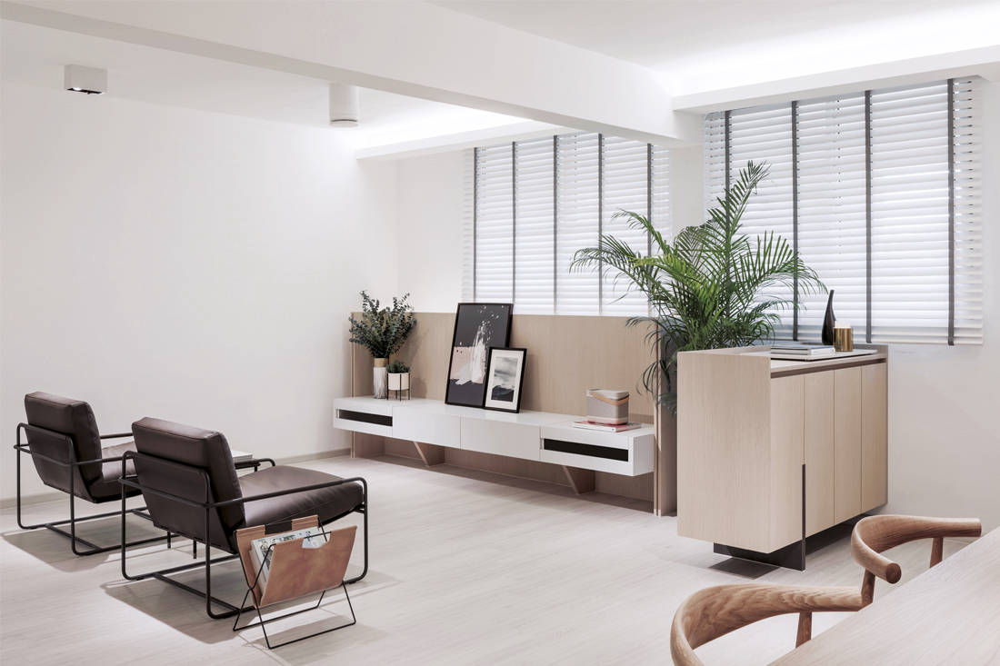
The core feature of this minimally configured home is a continuous framed portal that cuts across the living and dining areas, linking the bedroom and kitchen while opening up the entire flat. Classic Danish furniture pieces such as the CH20 Elbow chairs from Carl Hansen & Son and seamless carpentry elevate the minimal palette while composing an organic space – a canvas that evolves with the children.

Despite a constrained palette, the team enriched pockets of spaces within the flat with thoughtfully crafted details. Uniformed light oak panels envelop the console, subtly demarcating the living zone, while a pair of Frag lounge chairs sit softly across the area, elevating the mood of the space. The luxury of this open plan is enhanced with maximised ceiling height. Invisible cove lighting illuminates the environment softly, instead of strong lighting statement.

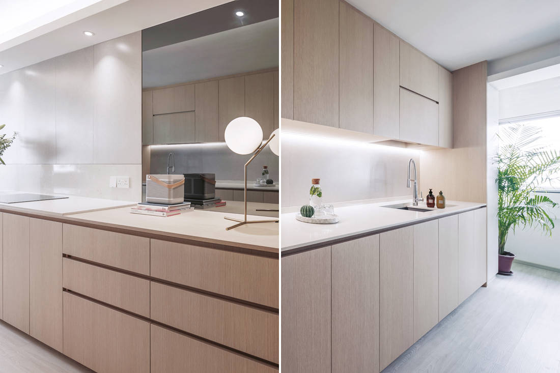
When it comes to the kitchen, having excess storage is always better than insufficiency; the latter often leads to clutter and disorganisation over time. “The most practical kitchens are usually the most normal looking ones,” says Alex Liu who adds that despite that, there are ways to avoid the standard kitchen look. While maximising storage, minor touches such as pull-handle carpentry and sunken plains add functionality while creating a seamless flow.
While conventional kitchens often stick out aesthetically, the kitchen integrates cohesively with the rest of the space. The strategic use of smoked mirrors continues, creating the illusion of depth and dimension. Light oak carpentry – a signature of Right Angle Studio – flanks the kitchen, optimising storage without imposing. A complementary sleek thin stove, white marble-effect quartz surface and recessed lighting complete the ambience and feel.

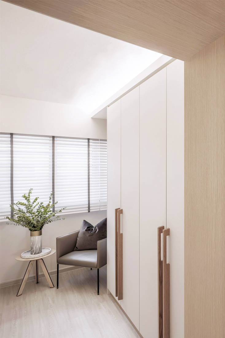
Threading the entire flat lightly, the grey tiles and white oak combination extends to the bedroom. “A light palette helps to uplift a space,” says Alex. Clean lines dominate, tracing wardrobes with vertical handles and furniture detailing, celebrating intricate craftsmanship. Without a single jarring element, a sense of tranquillity can be felt – a perfect respite from the hustle and bustle of the city
Right Angle Studio
www.rightanglestudio.com.sg
www.facebook.com/studiorightangle
www.instagram.com/right.angle.studio
We think you may also like Understated luxury in a Zen-like apartment
Like what you just read? Similar articles below

This four-room resale flat is all personality with its bold and dynamic blend of mid-century modern and retro elements.

OVON demonstrates how efficient space planning can enhance comfort and accessibility in a compact four-room flat.