This resale flat unit overhauled by Design 4 Space showcases a timeless modern classic style with a bold new twist.
4 June 2019
Home Type: 4-room HDB resale flat
Floor Area: 1,000sqft
Text by Disa Tan
Living alone, a bachelor in his forties didn’t want to play it safe with the modern classic design scheme of his home. “We proposed a classic colour scheme of monochromatic tones,” says Senior Design Consultant Shermin Lee who took charge of the renovation. “However, he asked for something bolder and we decided to get adventurous with the colour and material palettes in the communal zones.” The master bedroom, however, kept to a masculine colour palette of dark neutrals Unconventional Designs.

A brown-and-white ensemble of carpentry works makes up the matching wardrobe and study in the master bedroom. Shermin utilised laminates bearing rich timber textures to evoke a classic style. For a modern contrast, she used white-coloured laminates to create a sleek asymmetrical design for the wardrobe.

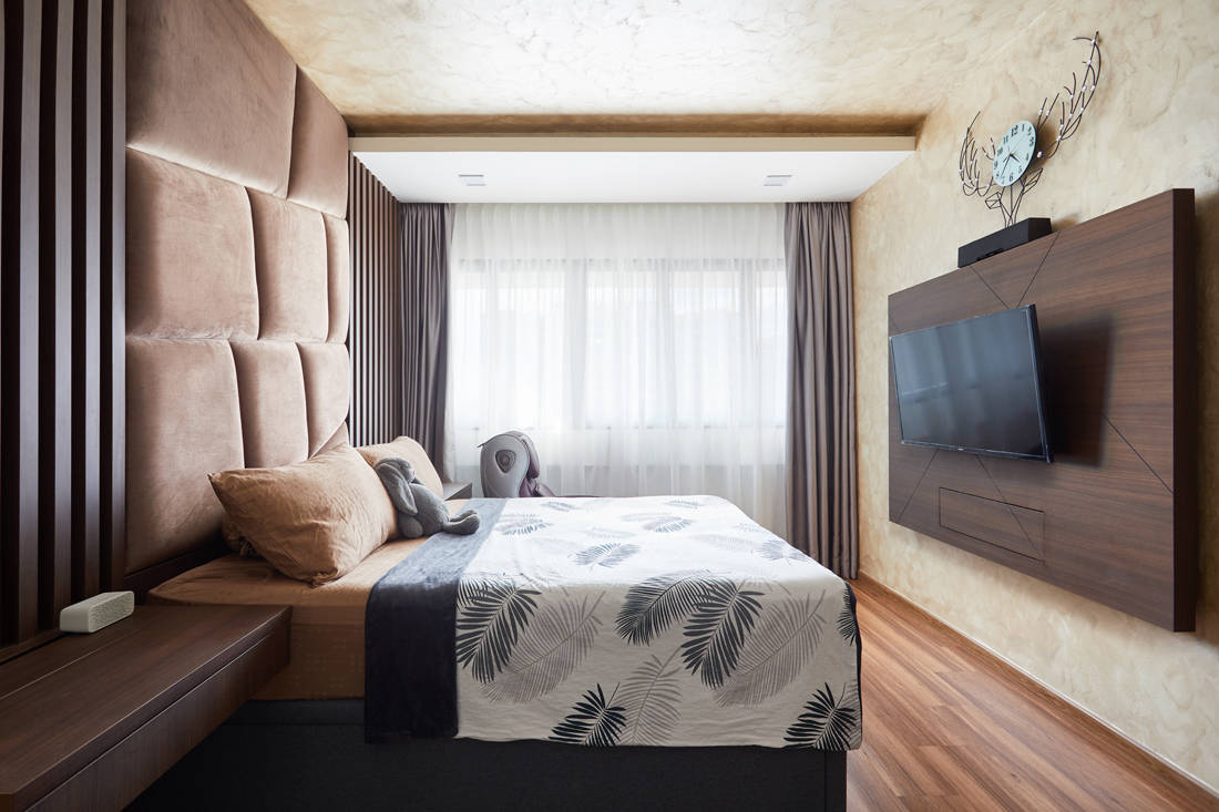
Awash in soothing shades of brown, the mood in the sleeping area switches to a calming one. A plush padded headboard spans the height of the wall and projects a regal presence. The lofty effect is accentuated by the unique cove ceiling and wall features, which sport special effect paint from the Nippon Paint Momento series.

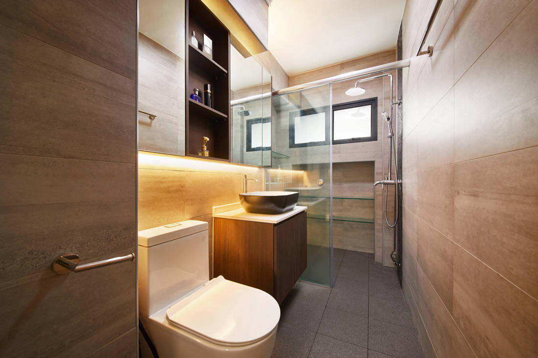
Following the soothing brown colour scheme in the master bedroom, the en-suite bathroom is swathed in a similar colour treatment of wood-look wall tiles. This presents a modern resort ambience and meets the homeowner’s request for a spa-inspired aesthetic. “He initially asked for a bathtub but it was not possible due to space constraints,” says Shermin. “We decided to go with the next best solution which was to conceive a relaxing ambience for him to luxuriate in.”

Things take a dramatic turn in the communal zones where Shermin has installed dark tinted mirror panels to create a grand welcome in the living zone. The overhead LED lighting helps highlight the mirror panels as well as the feature wall lined with custom-designed wallpaper that replicates the look of marble. Shermin also employed different floor tiles where various marble-effect tiles create visual demarcation for the foyer and living zone.

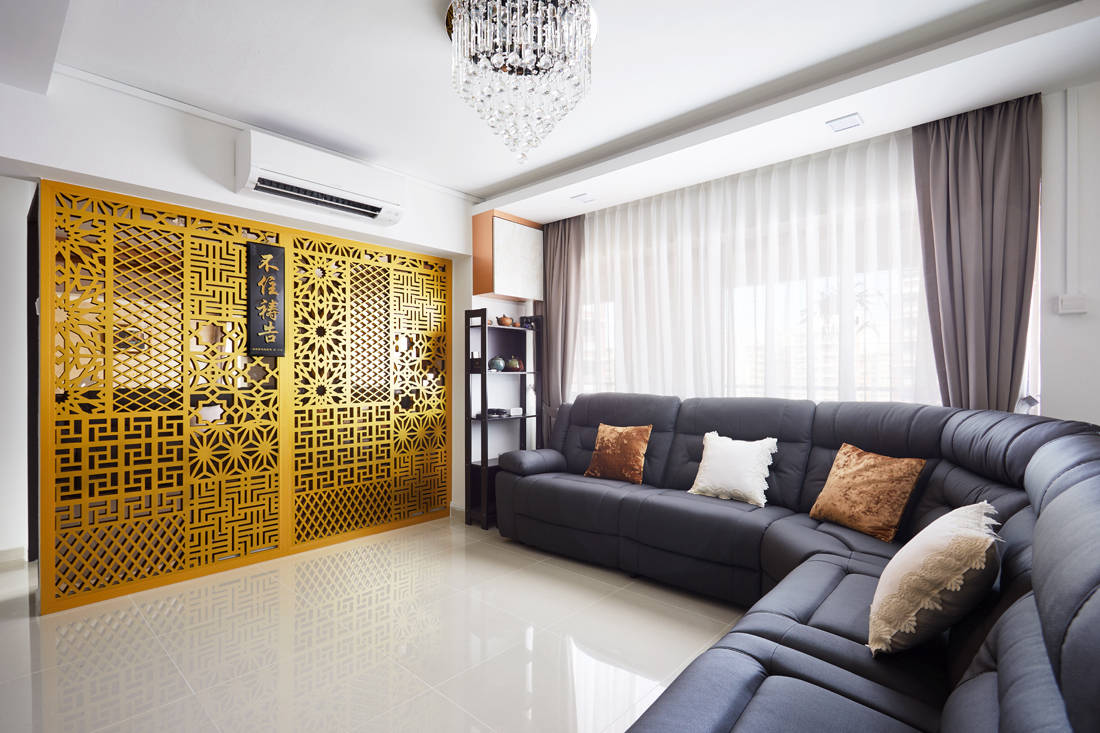
Much of the floor plan in the communal zones has been altered. This drastic reconfiguration afforded the homeowner a larger living space and three common bedrooms. The neutral colour palette used here not only lends the illusion of space, but also serves as a backdrop for the gold divider with elegant fretwork.

Besides altering the entrance of the kitchen to create a larger space that improves air and light circulation, Shermin paired red quartz countertops with matte grey cabinets for a daring style statement. She then employed two tile flooring treatments – one with wood-effect patterns and the other of hexagonal shape with eclectic-looking motifs. As a result, the kitchen looks classy yet edgy, and reflects the homeowner’s openness in trying bold and unconventional designs.
Design 4 Space
www.design4space.com.sg
We think you may also like 860sqft condo made bigger with an open-plan living space
Like what you just read? Similar articles below

Once an old and dingy flat, it has been completely overhauled by Vivre Creative Design into a clean and contemporary home for a school teacher.

Home to an avid tea connoisseur and collector, this flat serves as an intimate sanctuary for any tea lovers to relax in, and a catalyst to meaningful conversations.