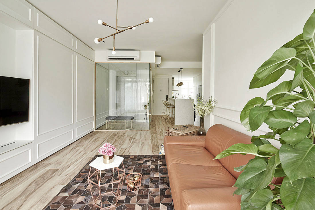
Clean-lined sophistication and a refreshed layout are effortlessly combined in this resale condo unit.
Home Type: 3-bedroom condominium unit
Floor Area: 1,300sqft
Text by Disa Tan
Elegance is an elusive quality that can’t be bought and married couple Bernie and Elisa have found it in their well-appointed condominium unit designed by Minimology. The designers were asked to reconfigure the existing layout and to update the look with a classic minimalistic style. “We were looking at an overhaul that involved refining the design proportions and alignment, and to establish a consistent colour and material scheme,” explain the designers.

To improve on its spatial flow, the design team hacked away the boundary walls between the private lift and kitchen. This proved to be instrumental in creating a spacious and light-filled ambience for the communal areas. Glass panels framed in brass are then used to enclose the private lift – for another level of security. “We tried to minimise the thickness of the frame in order to reduce the visual bulk,” says the team.
While the entire unit is swathed mostly in white tones and brass finishes, it is teamed with warm accent colours like the floor tiles which showcase soothing woodgrain patterns. Adding depth and dimension to the white laminate wall coverings are wooden trimmings in a classic moulding design.
An open-concept kitchen was adopted and this falls in line with the homeowners’ desire for more daylight streaming through their home. Adding a touch of luxe and texture to the open space is the kitchen island unit which is clad in marble-patterned Silestone quartz surfaces.
Subway tiles arranged in a herringbone pattern form the backsplash and an understated focal point for the L-shaped kitchen counters. This eye-catching symmetry breaks the otherwise stark and clinical feel of the predominantly white cookspace.
Overlooking a French-style window, the master bedroom is designed in a quintessential classic style. “The existing bedroom didn’t come with a bay window seat,” reveals the design team. “We added a custom-made settee with storage underneath to maximise the functionality.”
Decked in a marble-look laminate finish, the study desk brings a softer, feminine touch with its curved form. Behind it stands a frosted glass door which conceals the wet bathroom zone. The designers have demarcated the en-suite bathroom into two zones: one wet and one dry.
“The dry bathroom area was reconfigured in such a way that it can remain open and connected with the bedroom,” say the designers of this separate entrance into the dry zone. A customised mirror with a brass trimming now frames the vanity counter and the recessed lighting installed behind it evokes a sleek, floating effect. On the other side where the shower stall sits behind frosted glass panels, the same restrained material palette of homogeneous wall tiles and brass details instils design continuity. Summing it up, the design team says: “We believe that the notion of less is more will induce grandeur in this space, and this well-curated design palette speaks volumes of the entire home.”
Minimology
www.minimo.sg
We think you may also like This sleek and stylish condo hints at refined luxury