See how AP Concept restored this decades-old landed family home with a modern kitchen facelift and other style updates.
4 October 2022
Home Type: 2,630sqft
Floor Area: Terrace house
Text by Disa Tan
Plagued by deteriorating conditions like mould infestation and poor circulation, the owners of this three-storey terrace house sought the expertise of Raymond Ho, interior design manager from AP Concept, to turn things around. While parts of the landed home were still in good condition, Raymond recognised several areas needed a serious remodel.

The living room has been mostly left intact except for some cosmetic updates. Raymond says: “This space has a six-metre-tall ceiling and to really draw out that expanse, we overlaid the previously dark wallcovering with wallpaper of a brighter tone.” This striking contrast, which is further accentuated by tinted mirrors, now scales the vertical surface and creates a sense of lofty opulence.

A recommended addition by Raymond, this trio of large balloon pendants makes for an impressive lighting display in the living area.
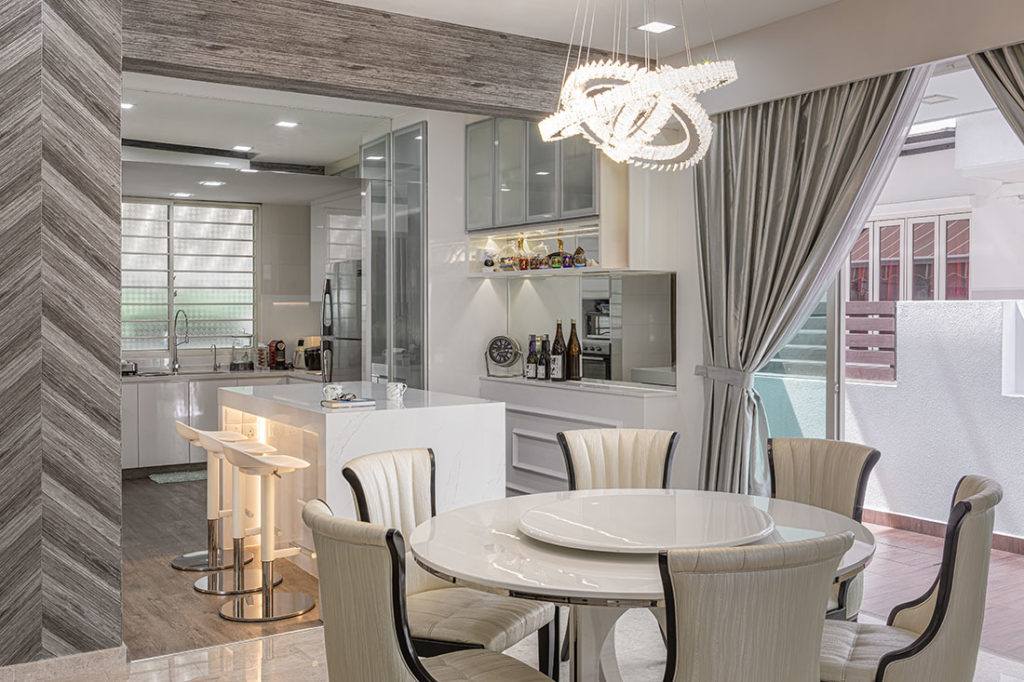
The kitchen went through a complete overhaul as the homeowners, a married couple with two daughters, wanted an open cookspace with updated entertaining amenities. “We basically hacked away everything and started from scratch,” says Raymond.

New counters and cabinetry have been installed and the choice of light hues with marble-look quartz countertops elevates the space with modern elegance. It also amplifies the maximum amount of light and visual space, something that the homeowners wanted for their new kitchen.

Another design detail that the homeowners were set on was a kitchen island. This all-white, marble-inspired quartz countertop surface now makes entertaining in this landed home an elegant affair.

To better establish the kitchen entrance from the other common areas, wallpaper in herringbone pattern now boldly frames the former.

With the homeowners’ daughters all grown up, they wanted to update their individual childhood bedrooms to more mature styles. The oldest daughter’s bedroom is now dressed in soft feminine tones, and is outfitted with new cabinetry, a study desk and a glass-enclosed walk-in wardrobe.

Inside her wardrobe, which comprises an open-pole system from OPSH, the eldest daughter’s dream of having a boutique-style dressing area comes true. “These open shelves also help to minimise the occurrence of mould in the bedroom, which was a problem before we stepped in to revamp the room,” says Raymond.

With a similar concept, the other daughter’s bedroom has pink curtains that cordon her wardrobe from the rest of the space. Raymond reveals that these custom curtains offer more privacy, and yet still allows her to have a boutique-style dressing area.

The daughters’ bathrooms have been overhauled as well. In the eldest daughter’s en-suite bathroom, Raymond hacked away the existing tiles and replaced them with stone-look and elegant monochromatic designs.

In the bathroom belonging to the youngest daughter, the walls and flooring now sport new tiles. The mould issue has been resolved, and the marble-like details inject an air of luxury and lightness into the space.
AP Concept
www.apconcept.com.sg
www.facebook.com/apconceptid
www.instagram.com/ap.concept
We think you may also like A terrace house with a large and airy kitchen
Like what you just read? Similar articles below

It’s not an impossible dream. Here’s how you can create a kid-friendly home that’s safe, comfortable and stylish for all to enjoy.

By thoughtfully revitalising existing structures, this luxurious home by Create Architecture embraces nature and light as defining elements of tropical living.