Walls have been taken down where necessary to facilitate an improved flow of spaces for a young couple who reside in this minimalist flat.
25 July 2019
Home Type: 4-room HDB BTO flat
Floor Area: 990sqft
Text by Vanitha Pavapathi
Clean, bright and well-planned best characterise this BTO flat designed by AP Concept. It too, embodies a relaxed and easygoing vibe like the young couple who resides here.

At 990sqft, the flat is considered fairly spacious for the couple. But the communal space that makes up the living and dining areas is pretty narrow. Not to mention, space clearance had to be accommodated for entry into the wet kitchen.

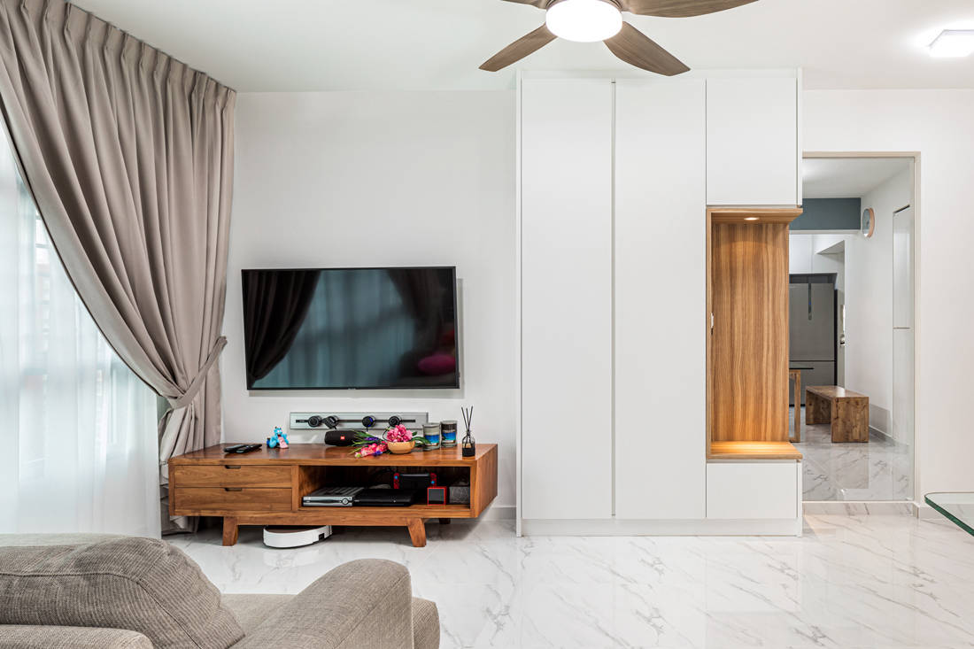
With valuable real estate given to a walkway, and then some to the corridor that segues into the bedrooms, careful space planning was essential. Getting appropriately proportioned living and dining room furniture was key to establishing two separated yet interlinked spaces. Glass-topped table lends visual lightness to the dining area while a bench maximises space. This approach allowed room for a floor-to-ceiling shoe cabinet in the living space.

Similarly, the design team built a full-height cabinet with a niche just outside the existing kitchen to fulfill the couple’s need for separate wet and dry kitchens. This transitional space, where the fixture now stands, houses the refrigerator, water filter and other equipment; and interacts with the wet kitchen and dining area seamlessly.


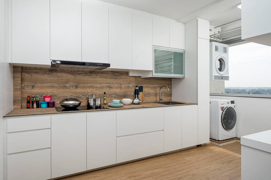
The visual dialogue, however, doesn’t stop there. The wet kitchen completely opens up to the service yard, as the wall that separated the two distinct spaces has been demolished. Here, cement mortar sink breaks up the monotony of the white cabinetry while an extendable countertop next to it provides additional work surface.


In the master bedroom, the design team knocked down a wall to accommodate a walk-in wardrobe. The wardrobe doors with oak wood-like laminates that don the inset handles not only function as a feature, but also add much needed warmth to the bedroom furnished in a cool colour palette.

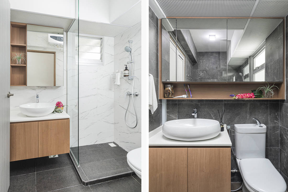
For a consistent design language and to brighten up the common bathroom, homogenous tiles that echo the communal space are laid over the walls. The master bathroom employs the same approach but the tiles are of a darker hue. Instead of fully enclosed shower screens that could potentially make the bathrooms feel cramped, the design team proposed fixed glass panels that do the same job – prevent water from splashing out to the dry zone.
Evidently, the subtle connectivity between open and closed spaces throughout this flat is akin to a well-concerted rhythmic dance, which the design team have executed to great effect. More importantly, it dances to the rhythm of the owner’s lifestyle.
AP Concept
www.apconcept.com.sg
www.facebook.com/apconceptid
www.instagram.com/ap.concept
We think you may also like Minimalist living: 6 fab ideas from Singapore homes
Like what you just read? Similar articles below

For a couple that loves Mickey Mouse, Notion of W designed a home with subtle touches inspired by the famous mouse.

Despite this four-room flat’s compact size, Happe Design Atelier managed to create bright and open lounging areas, fulfilling a couple’s dream of having an art deco-inspired space to hang out with friends.