With a fresh new configuration and a space-enhancing material palette, this flat designed by Archive Design looks far more spacious than the average 4-room HDB flat.
13 February 2020
Home Type: 4-room HDB BTO flat
Floor Area: 1,100sqft
Text by Disa Tan
The Scandinavian style approach formed the basis of the design brief for this brand new HDB flat belonging to a married couple in their thirties. Design Director Lucas Yang of Archive Design, who took charge of the renovation, says: “The homeowners favour the bright and cosy appeal of the Scandinavian look. So, we translated their design aspirations through a neutral backdrop of whitewashed walls accented by warm wood elements.”
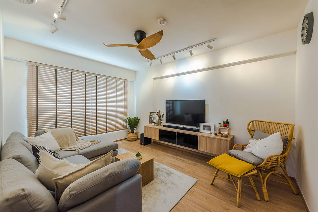
Prominent in the living area is therefore a streamlined setup of white walls and furniture in warm neutral shades. The use of vinyl flooring and wooden blinds complete the clean-lined setting with a hint of cosiness.
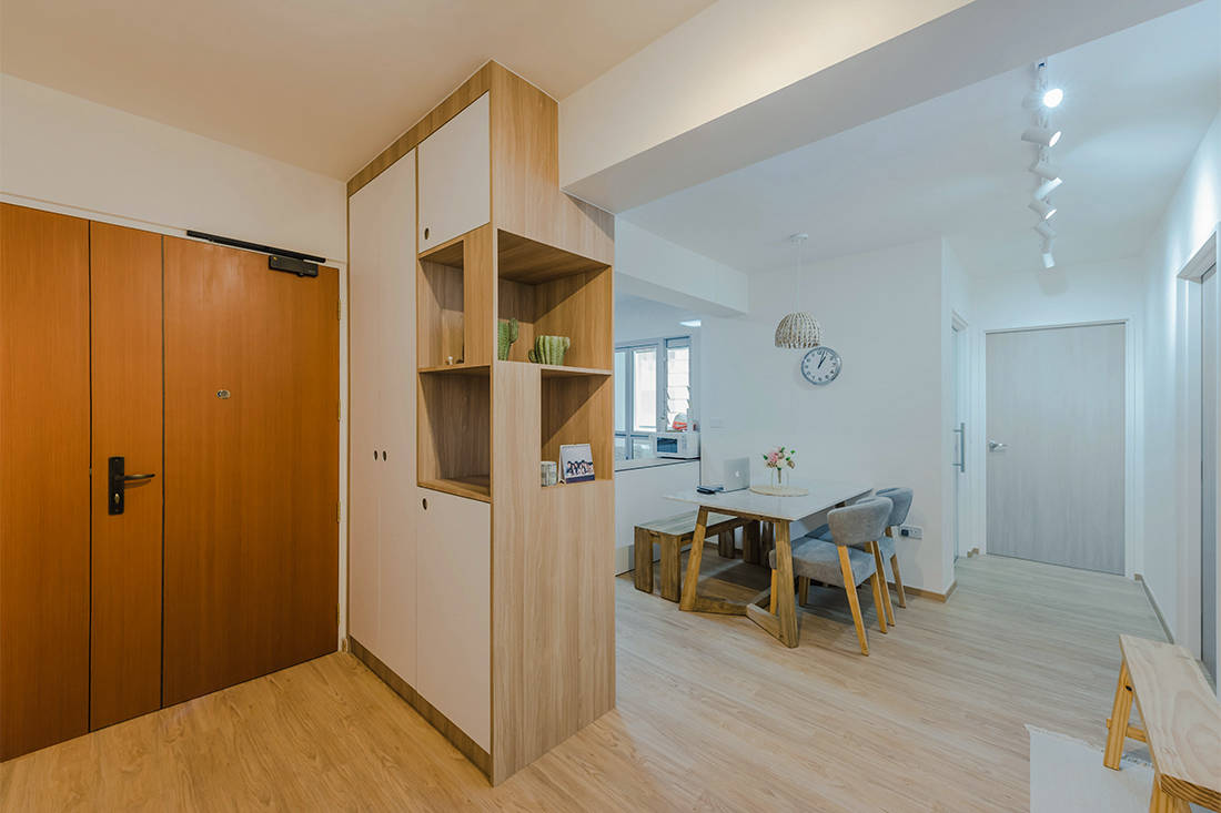
To create a proper foyer area, Lucas together with his colleagues Rachel and Felicia, designed a full-height storage divider to anchor the front entrance. Open and closed storage compartments frame two sides of the tall unit and create an interesting visual statement.

With the storage unit in the foyer providing a privacy screen for the dining area, it shields prying eyes even with the front door open. For this reason, the homeowners can enjoy their meals with minimal disruption.
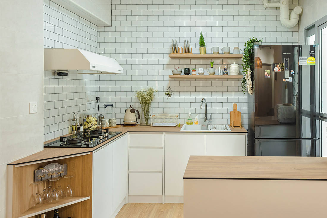
Noting that the homeowners love having company over, it was only fitting to reconfigure the layout in favour of an open-concept kitchen for their entertaining needs. Showing off a backsplash of white subway tiles and compact panels from EDL as countertops, this clean-cut ensemble presents a spacious and bright outlook for the cook space.
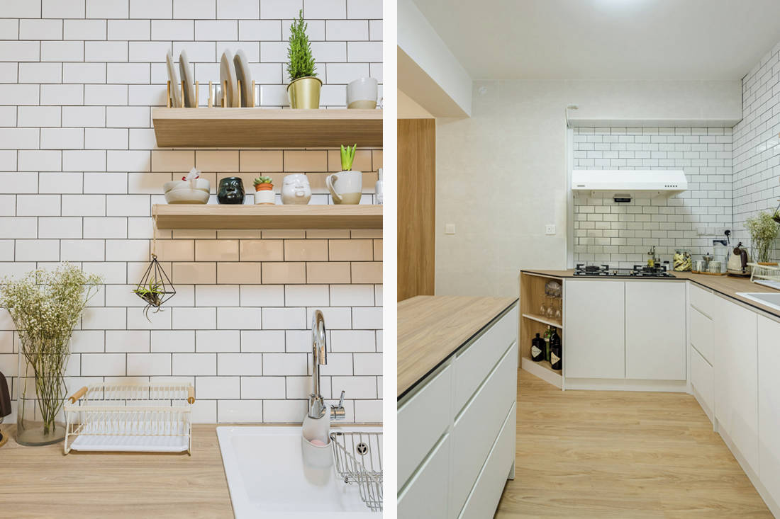
Navigating the corner with a slanted cabinet unit, this arrangement is more space-friendly than a usual counter with sharp corners. Another highlight is the moving island unit-on-wheels. “The homeowners can make more room or clean the kitchen floor efficiently by moving away the island counter,” explains Lucas.

Another part of the flat’s reconfiguration sees the master bedroom and a common bedroom merged together. Consequently, this creates a much brighter and bigger private ensuite, and a dedicated space for the wardrobe and dresser. With the walls painted in a pristine shade of white and matched with wood-look vinyl flooring, this breezy setup ushers in the warm and open quality of the Nordic style.
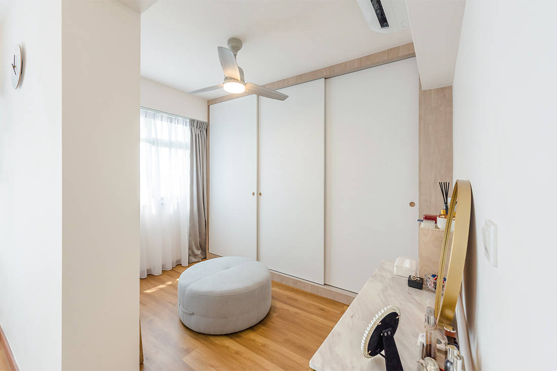
Now a walk-in wardrobe, the original common bedroom is outfitted with a full-height sliding wardrobe. To keep up with the ongoing Nordic look, the choice of recessed wardrobe handles in the form of circular cut-outs creates an understated and seamless effect.

For the master bathroom, a similar series of white square-shaped tiles fills the wall. This establishes a visual connection between the bathroom and the kitchen. A mirror cabinet that stretches along the wall helps to maximise the functionality of the space. At the same time, it keeps things neat and tidy.
Lucas, Rachel and Felicia of Archive Design had executed the in-demand Scandinavian style well in this home. Not to mention, it exudes a sense of openness without losing the warmth of home.
Archive Design
www.archiveindesign.com
www.facebook.com/archiveinteriordesign
www.instagram.com/archiveindesign
We think you may also like Airy living in a compact 757sqft apartment
Like what you just read? Similar articles below

Classy curves lead the way in turning this standard BTO flat into a picture of modern classic design.
This four-room BTO flat in Geylang is fun and quirky and reflects the personalities of its highly creative owners. Take the tour.