Luxe living takes over this petite apartment that features a clean-lined yet highly sophisticated design language. With well-planned design measures by Nest Spatial Design, the homeowners are sure to live large even in this small space.
8 May 2019
Home Type: 1-bedroom apartment unit
Floor Area: 510sqft
Text by Disa Tan
Being short on space was definitely a concern for the homeowners, a well-travelled married couple in their early thirties. The strategy that the Nest Spatial Design team engaged was to create more space out of the apartment’s limited square footage.

Although this double volume apartment comes with a single bedroom, the Director of Nest Spatial Design, Chad Toh, decided to demolish the walls and integrate the space into the living room.

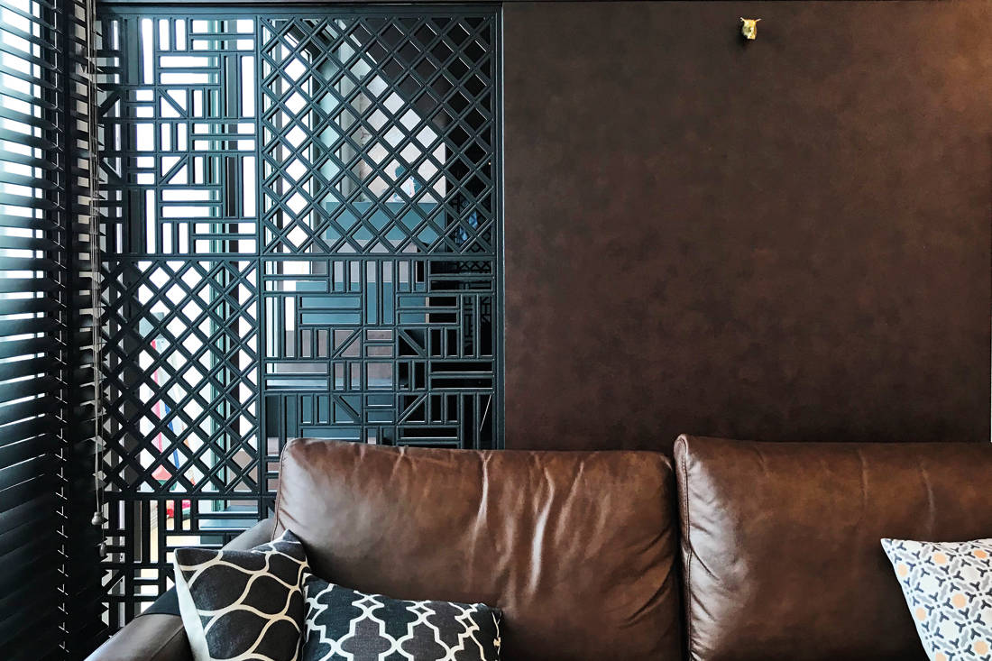
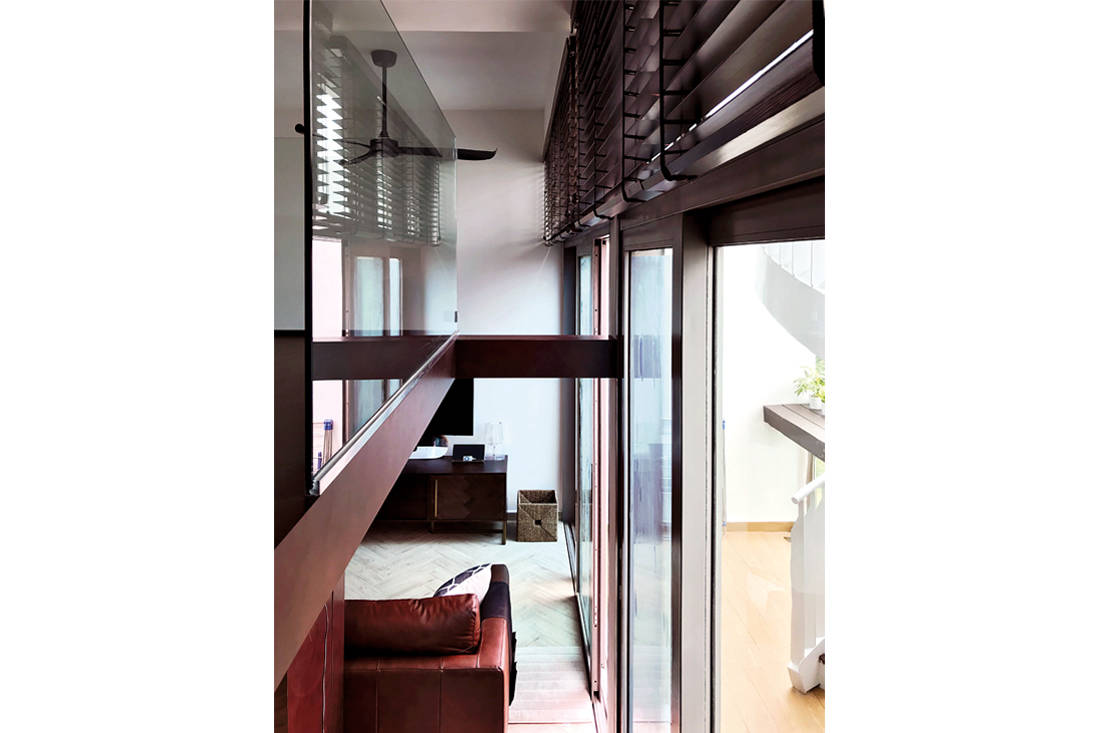
Replacing the boundary walls with these fretwork panels makes a huge difference in the distribution of light and space in the apartment. Daylight filters through the dividers and glass railings, bathing the newly transformed studio apartment in natural light while still allowing the homeowners to retain privacy and enclose the walk-in wardrobe.

Chad also established a running theme of metallic motifs to pair with the dark laminate finishes for a clean and chic aesthetic. Simple but stunning design features – like the homogeneous floor tiles that have been laid out in a herringbone pattern – fill the studio apartment with character. Most importantly, these understated gestures do not overwhelm the small stature of this home.

To fully utilise the high-ceilinged apartment, Chad designed an elevated space that now houses the bedroom. He explains: “Having the bed placed in the original proposed bedroom would only diminish this already space-starved studio apartment. By placing the bedroom on a raised level, we managed to free up the space below to allow for a larger walk-in wardrobe.”

The steps that lead up to the elevated bedroom features a colour scheme that alternates between matte black and faux brown leather. Besides offering access to the raised bedroom level, these multi-purpose steps are also packed with storage solutions. The designers built niches and alcoves into the steps, allowing the homeowners to store and display books and decorative objects.

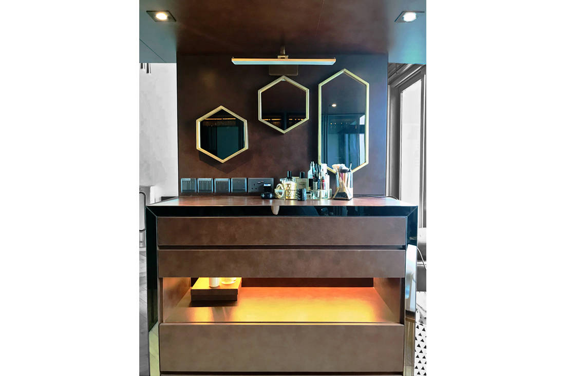
Set behind the sofa is a well-dressed vanity bearing a faux leather finish. This bespoke piece is outlined with tinted mirror strips and recessed lighting. These luxe embellishments complement the series of geometrical mirrors mounted on the wall. While one would think that the wall mirrors are customised as well, Chad and the homeowners actually found them when looking for accessories to finish the home.

The walk-in wardrobe below the bedroom is supported by carpentry works such as the steps and the wardrobe itself. This two-pronged design approach not only provides storage, it also eliminates the need for additional pillars. This saves on floor area and truly maximises every inch of the space, resulting in a well-planned layout that fits the homeowners needs and lifestyle.
Nest Spatial Design
www.nestsd.com
We think you may also like A modern monochromatic flat fit for entertaining
Like what you just read? Similar articles below

Studio Wills + Architects has rethought living in a ‘shoebox’ apartment.

Warm textures, clean lines and a minimalist palette define this home for a family of three.