There’s nothing more gratifying than a transformation that meets the owners’ desire for a stylish, contemporary HDB home. Its timeless appeal also incorporates their feng shui requirements for good Qi with the use of colours.
8 August 2019
Home Type: 5-room HDB flat
Floor Area: 1,100sqft
Text by Sandra Campbell
Like most creatives, interior designer Tommy Tan of Dots N Tots Interior loves a good challenge. So when the owners of this Woodlands Drive HDB home approached Dots N Tots Interior with the desire for a more calming, open-plan space that welcomes good health, abundance, harmony and more after consulting a feng shui master, he took on the project.
“It’s amazing how simple solutions can make all the difference. I proposed representing the five-elements principle by working with the feng shui master’s limited colour palette and introducing other complementary hues as accents. This is one of the easiest ways to internalise good Qi and keep it. Harmony and prosperity could then circulate through the home.”

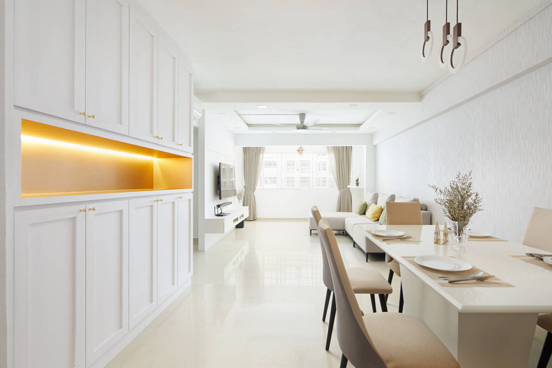
White, for instance, belongs to the metal feng shui element. Its energy is crisp, clean and fresh. It is also the colour of new beginnings, as well as clear endings. The owners wanted a white paint Tommy found rather jarring. Instead, he got their approval to use a low-maintenance fabric wallpaper with a leather finishing that would soften the look yet reflect light. This makes spaces appear larger, more tranquil, stylish, inviting, and cooling when it is warm outdoors. For continuity and functionality, the shaker cabinets are mostly white too.
It’s really hard to imagine these as the same living and balcony areas, but Tommy saw dramatic potential. He made the reinforced concrete hanger separating the balcony from the living room ‘disappear’. To achieve that, he created a false ceiling with carpentry that blends seamlessly with the rest of the living room and actually extends the area. This made it possible to increase the feature wall from six to ten feet, and have it conceal part of the walkway to the bedrooms for privacy too.

Additionally, a recessed section of the ceiling with cove lighting adds warmth and defines the living area from the dining section. The finished effect: a larger, sleeker and more inviting ambience that’s classy and hyper-functional without being stuffy. It’s ideal for both lounging and entertaining too.

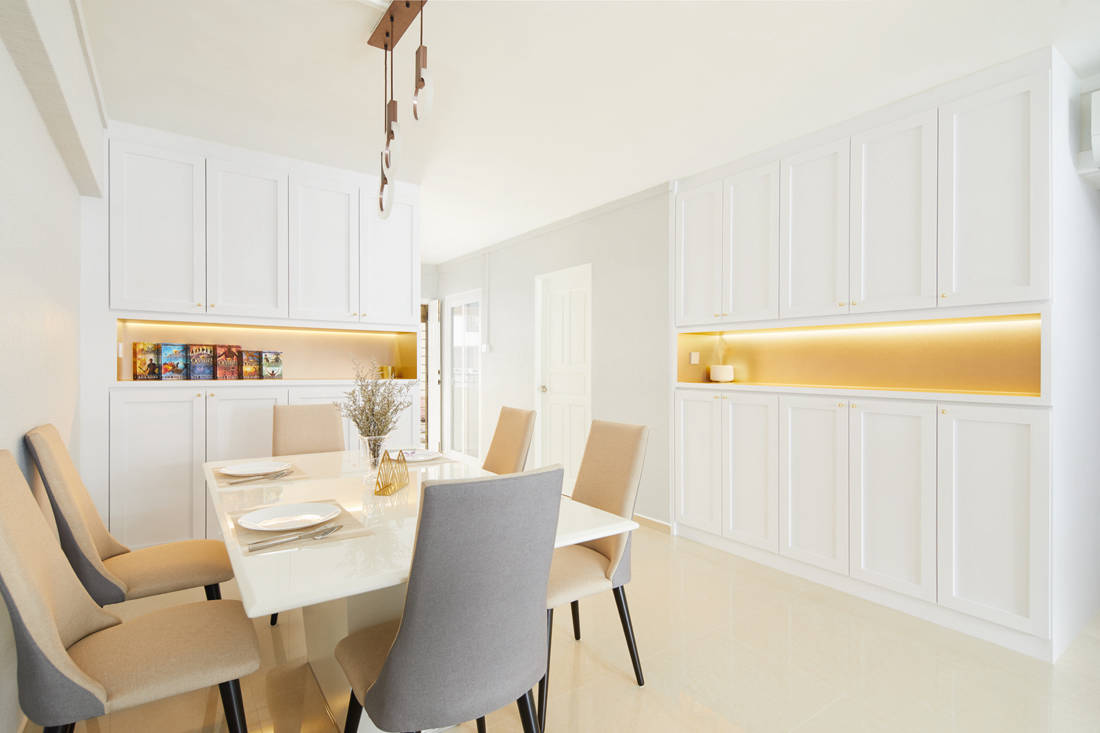
The previous entrance to the home had an unnecessarily wide wall. So, Tommy hacked most of it away and added these built-in, full-height shaker cabinets for shoes and other belongings. Low-maintenance, homogenous tiles dress the entrance, and the dining and living areas for a streamlined look. A second portion of the cabinets wraps around a wall leading to the bedrooms, and includes a last section for laundry with a flip door, so occupants can drop used and wet clothes inside.
He chose beige and grey fabric chairs for the dining area. In feng shui, beige expresses the earth element with its nourishing, grounding energy. Grey, also on the fabric sofa, is a metal element said to improve parents’ relationships with their offspring, increase creativity, gratification with a job or hobbies, and even aid fertility.

Above the table is a talking-point circular-bulb light fixture. “A circle is ‘yuan’ in Mandarin and sounds similar to ‘tuan yuan’, which stands for family reunion,” explains Tommy. “We wanted this area to be a place where everyone could gather often to bond and share warmth over a meal.” Circular objects are also said to activate and balance one’s wealth-producing energy. Another unique feature is the illuminated brushed gold laminate in the recessed areas of the cabinets. Gold brings light and life to all beings, and is important because of its ability to generate water or riches.

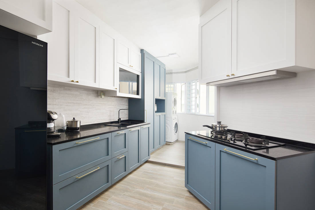
“The original kitchen had many odd angles and an awkward partition that separated the laundry area. The owners simply conveyed that the oven, hob and hood had to be set against the angled wall as recommended by the feng shui master for good Qi,” says Tommy. As a response, Tommy removed the partition, so the washer and dryer sit flush with the white and blue shaker cabinets. They line up with the fridge, sink and other appliances for an organised appeal.

The blue of the cabinets and fridge represent the water element, inspiration, prosperity, dependability, and security. On the floors, water- and heat-resistant porcelain tiles lend an edgy finish.
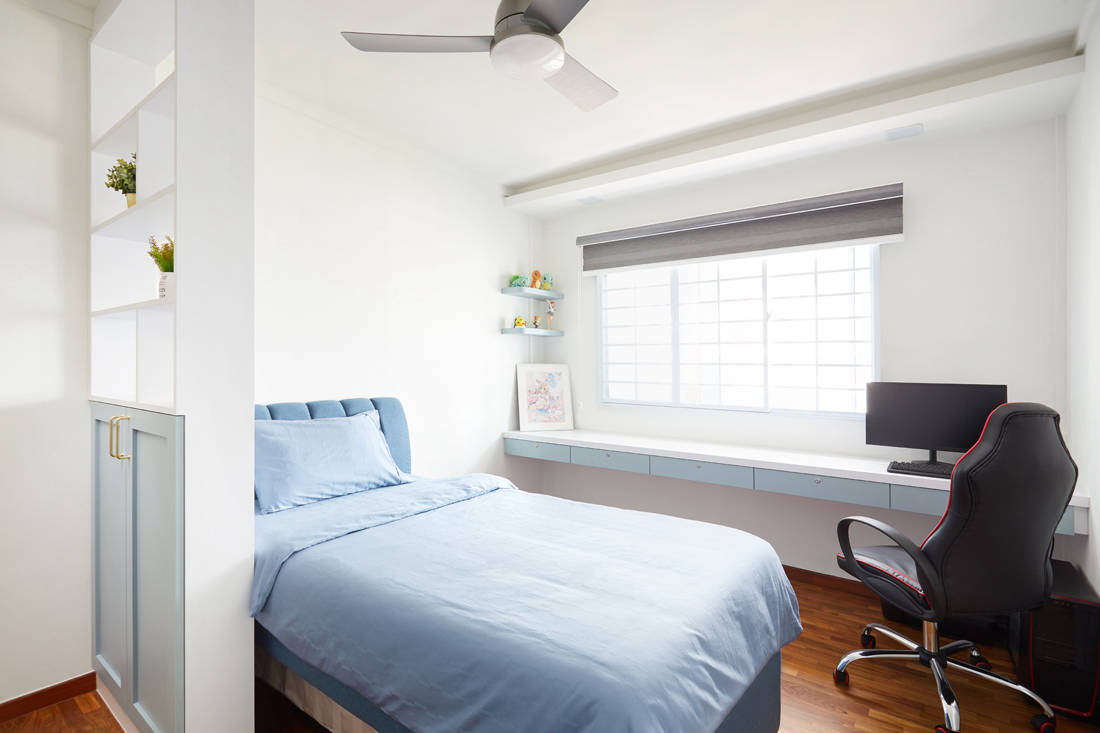
Just as challenging was the master bedroom. “It had a weird corner with a slanted edge and an irregularly-shaped wall that made it look cramped,” shares Tommy. “I opened it up to give the owners a functional yet serene space, and the big, built-in wardrobe they wanted. It’s a full-height, 10-foot wide shaker-style with a small shelf-cum-bedside table at the corner to hide the slanted edge.”

As Qi enters and leaves a room through windows and doors, the master bed had to face away from these openings. Tommy then added a divider for privacy, plus a dressing table with simple ledge and shelf. On the floor in here as well as in the other bedrooms are parquet to create warmth.
Watch this home reveal video walk-through with before and after pictures.
Dots N Tots Interior
www.dotsntots.com.sg
We think you may also like An HDB flat inspired by the Japandi style
Like what you just read? Similar articles below

Metaphor Studio manipulated the layout of this Pinnacle@Duxton resale flat as a stage for a couple to live out their best lives for many years to come.

A couple dreamt of having cool audio and visual experiences at home, and called upon Plush Interior Design to make it all possible.