Archways and raw, natural surfaces define this wabi-sabi apartment, making it a delightful haven for a couple.
7 June 2022
Home Type: 2-bedroom apartment
Floor Area: 1,000sqft
Text by Janice Seow
When you enter this apartment, there is little to suggest that it was once a typical two-bedder unit with a fairly modest footprint.
Designed by alittlepractice for a couple, the aptly named “Moonstone apartment” is defined by a series of playful arches that stir one’s curiosity as it subtly draws the eye deeper into the space.

According to the designers from alittlepractice, the original plan featured “a tight corridor leading to smallish rooms”, and a compact kitchen.
“The owners had a preference for natural materials and finishes, and were drawn to elements associated with the wabi-sabi ideology. They especially indicated their love for arches after being inspired by their travels,” say the designers. Given their love for entertaining, it was also important to the couple that their home be spacious enough to welcome friends and family.

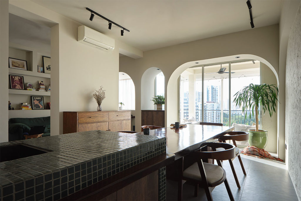
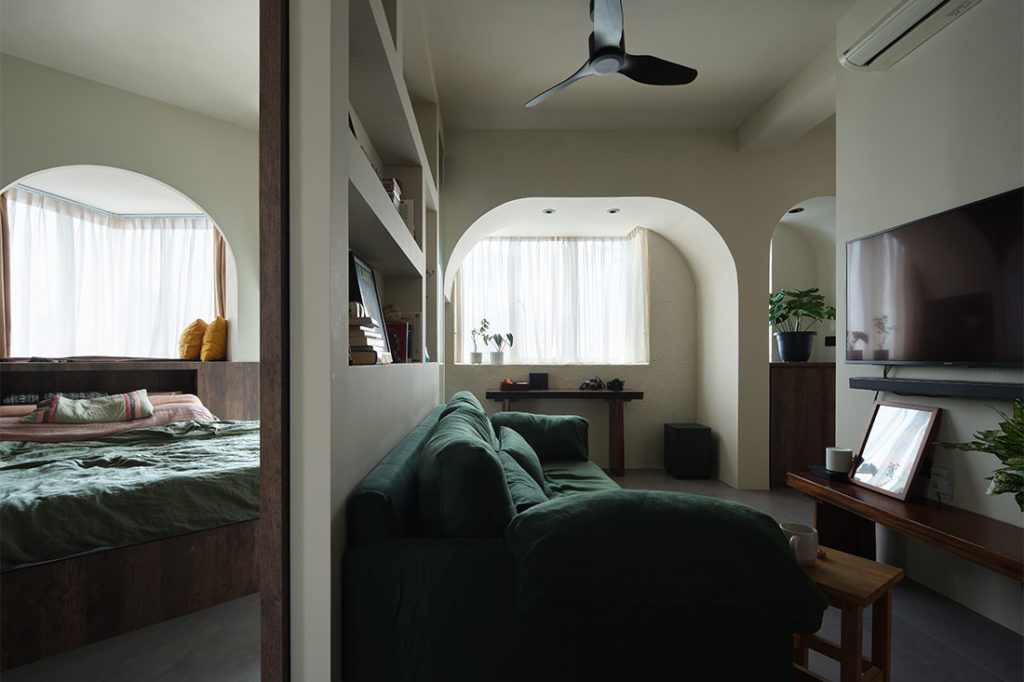
The walls to one room have been demolished to establish a larger communal area that also extends the visual depth of the unit. Additionally, the designers were now able to insert a sizeable dining space and pantry, and create a cosy (but still roomy) living area.
“In this apartment, the series of arches create a consistent language to tie up various openings and to add interest to the spaces,” say the designers. “We kept the material palette simple, using warm plaster tones on the archways rather than conventional white, which gives the home a homely feel.” Smooth and rough plaster textures also help to differentiate the different surfaces and areas.

More raw and natural, tactile surfaces continue the design narrative. Timber-look laminate finishes come in more rustic tones, and joinery take on more primitive forms.

Spatial zoning was key in establishing the balance between open and private areas. “We used cabinetry to demarcate the different zones; the living and entertainment spaces, the rest zone and the sleeping area. The three zones are laid sequentially with openings such that the can be read as one larger space when the doorways are opened,” say the designers, adding, “The series of continuous archways makes the space appear larger than it is, leading the eye to borrowed vistas from beyond.”

Given the owners’ love of entertaining, the foyer, pantry and dining area are designed as one primary space. The large table at the front of the apartment becomes a flexible activity hub for hanging out, having meals, hosting, and even to work. Additionally, this space extends visually into the balcony, which has a seating area for lounging.

From the main dining space, one can proceed to the living area past the arches and through a couple of openings on either side of a wall divider, and from there, further in to the bedroom for privacy and rest.

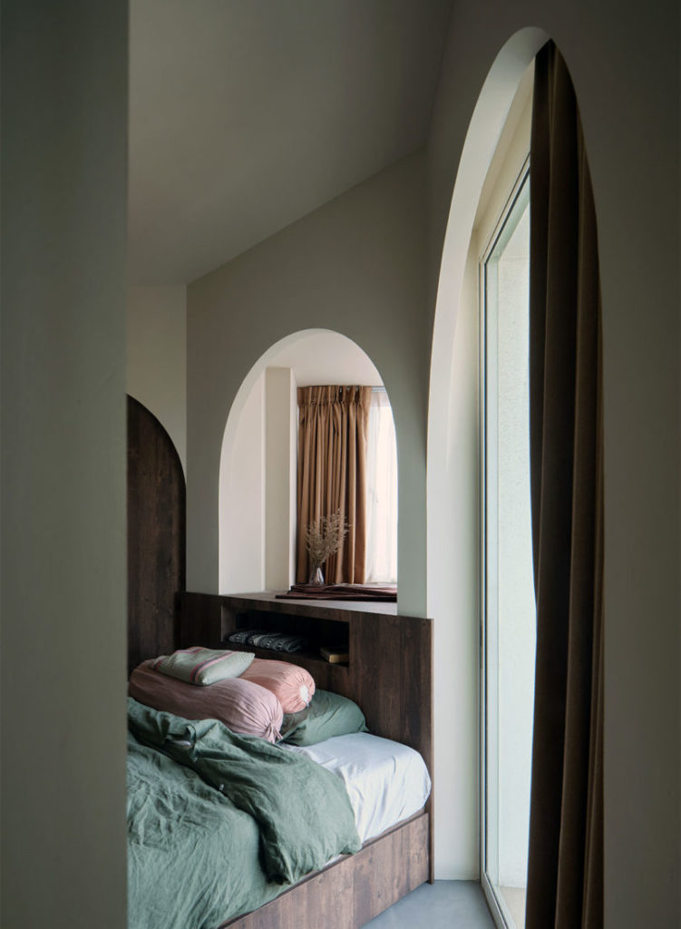
The angled positioning of the bed against the bay window not only enhances the sense of space in the master suite, but creates a cosy and meditative nook that’s once again framed by an arch – a feature that so defines this apartment.

alittlepractice
www.alittlepractice.com
Photography by Fabian Ong
Shop the Look
Homogeneous floor tiles from Hafary
Bathroom and pantry unit in green glazed ceramic tiles from Unlimited
Laminate panels for some walls and most carpentry from Lamitak
Lighting fixtures from Luxlight
Contractor, JP Renovators


We think you may also like 8 great wabi-sabi interior design tips for your home
Like what you just read? Similar articles below

Life revolves around the kitchen in this relaxed and family-friendly dwelling designed by HEI Architects

In this 1,001-square-foot flat in Joo Seng Road, integrating smart appliances with minimalist design is the ultimate goal.