Loco Division reimagines a BTO flat into a warm, functional and quietly eclectic first home for a pair of ‘90s kids with differing tastes but shared priorities.
10 April 2025

Home Type: 4-room HDB flat
Floor Area: 1,001sqft
Text by Aria Tan
For SH and Gene, fifth time was the charm. After four rounds of BTO applications, they finally landed their flat in the northeast of Singapore – close to family, and brimming with potential. It would become their first home together, and they were determined to make it feel like a reflection of who they are: homebodies with a love for quiet evenings in, game nights with friends, and a space that worked as hard as it played.

The brief was clear but not simple – combine her love for mid-century modern design with his preference for clean, Scandinavian lines. And it had to be practical: a kitchen that could host, work-from-home zones for both, ample storage, and just enough personality to make it theirs.

Designer Debbie Lim of Loco Division was up for the challenge, not just professionally, but personally. “This project was super close to my heart – I’ve known the wife since we were 13,” she shares. “Getting to design her first home honestly felt like such a full-circle moment.”
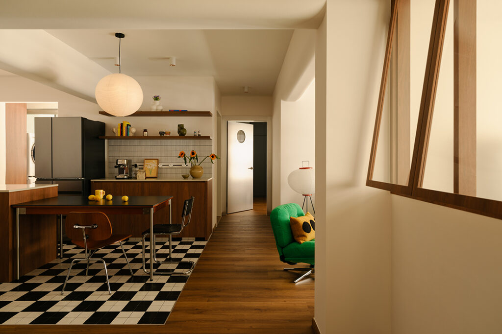
Rather than sticking to the conventional BTO layout, Debbie proposed a smart inversion of space. The original living room was turned into a light-filled study, complete with custom top-hung timber windows and a Japanese-style noren curtain – offering separation without the need for solid doors. The living area was shifted centrally to face the open kitchen, creating a seamless flow between lounging, cooking, and dining.

Throughout the flat, materiality plays a diplomatic role – walnut wood tones serve as a warm bridge between styles, paired with cabinetry details and clean lines that nod to Scandinavian simplicity. In the kitchen, the black-and-white checkerboard floor tile feature is a retro throwback, anchoring the dining and pantry zone without adding weight. “We went with a custom black-and-white mix that almost reads like a graphic rug – it helps break up the open-plan layout and defines the kitchen and dining zones without adding bulk,” Debbie explains.
From a chrome-punctuated door to the master bedroom (enlarged by combining two rooms) to the sculptural IKEA swivel chair in the living room, the home gently leans into retro touches – quirky without being kitsch, nostalgic without being theme-y.
Personal touches ground every corner: a framed quote in the “his” bathroom (common bath), art around the Samsung Frame TV, a Kit-Cat Clock wagging its tail in the dining area. Even the spatial tweaks – the dual-purpose study that could one day become a nursery, the gaming nook discreetly tucked into the wardrobe zone – hint at a future-minded design that doesn’t forget to enjoy the present.
It’s a home that feels cohesive but never cookie-cutter. It’s honest, a little cheeky, and built with heart.


Loco Division
www.locodivision.net
www.instagram.com/locodivision
Photography by Marcus Lim
We think you may also like Mid-century modern charm with unexpected twists

Like what you just read? Similar articles below

Having come upon a conservation house that had been subdivided into smaller apartment units, one couple seized the opportunity to build their rather unusual dream home.

MONOCOT’s refresh of this conservation flat includes a new courtyard, an open plan and mid-century modern vibes.