Tasked with creating a family gathering space in the garage of their client’s home, 182 Design has adopted a pavilion sensibility, which suits the climate and footprint well.
20 September 2023
Text by Gillian Serisier
Designing for a three-generational family of builders, there was a need for the design of this residence – Wabi Sabi Pavilion – to explore building materials in a unique, but clarifying way. “The linear planning of their old house felt disconnected for their growing family, who collectively felt the need for a space that would encourage togetherness,” says Lokesh PB, 182 Director and project lead.
As such, the design aesthetic draws from an eclectic blend of traditional and contemporary Indian design elements including cement oxide floors, wood ceilings, rattan furniture, and Indian stones and marbles.
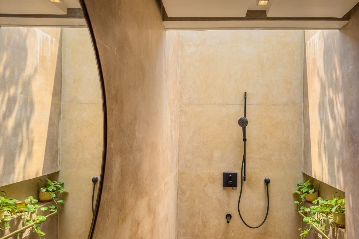
“The conscious selection of materials and furniture that were primarily sourced locally, helped minimise the embodied carbon of the space. The project was an experiment with contrast of textures and finding beauty in the imperfections of materials while trying to maintain a cohesive and minimal aesthetic,” says Lokesh. The small indoor bathroom, for example, is entirely clad with a natural, yellow, Indian Marble. A standing basin in the same material gives the room cohesion, while the small skylight over the shower area floods and softens the tone with a profusion of light.
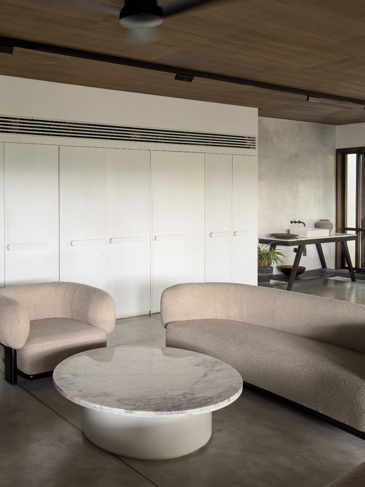
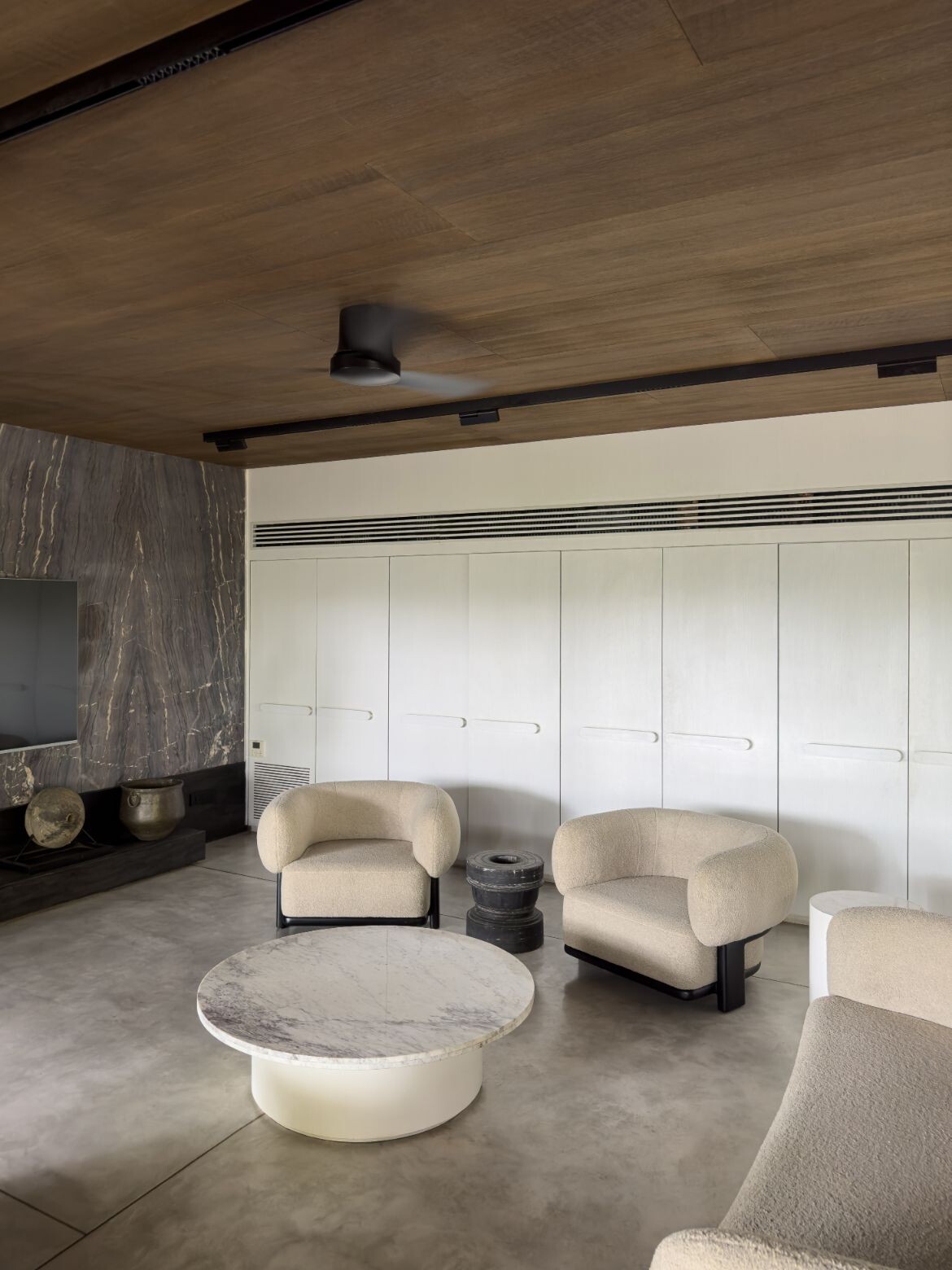
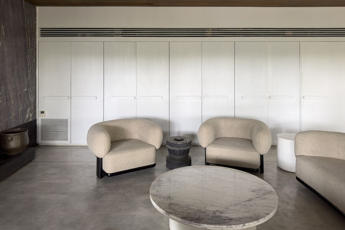
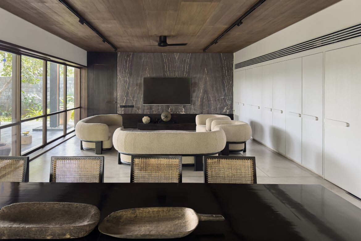
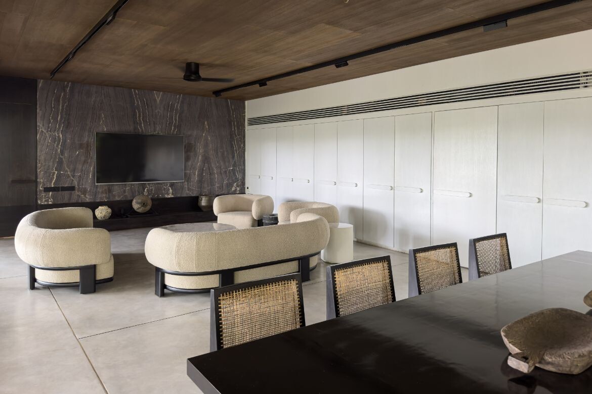
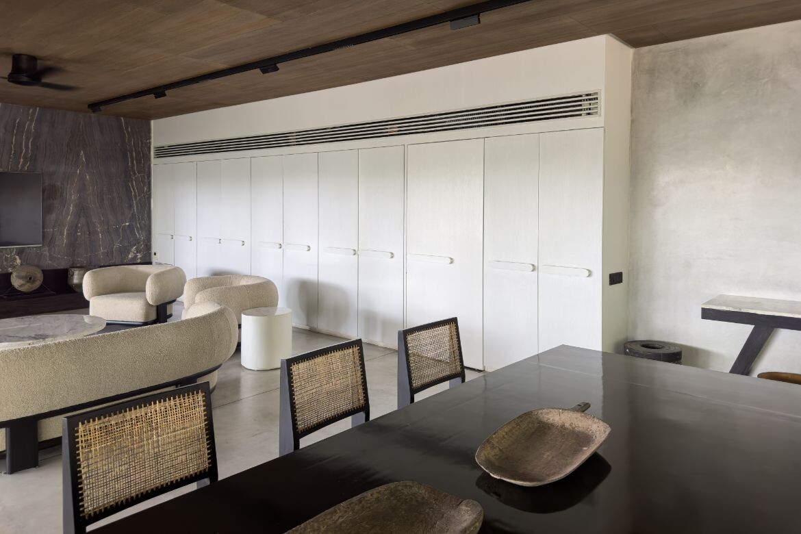
Marble is again used for the wall at the end of the large internal room. In this iteration, a highly figured brown marble has been book-matched to deliver a wall of sumptuous beauty. Between the polished concrete floors (with brass inlays), polished plaster walls and walnut veneer ceilings, there is a rich diversity of reflective qualities at play. These moreover, are activated by the large facing and end walls of glazing that flood the whole with light.
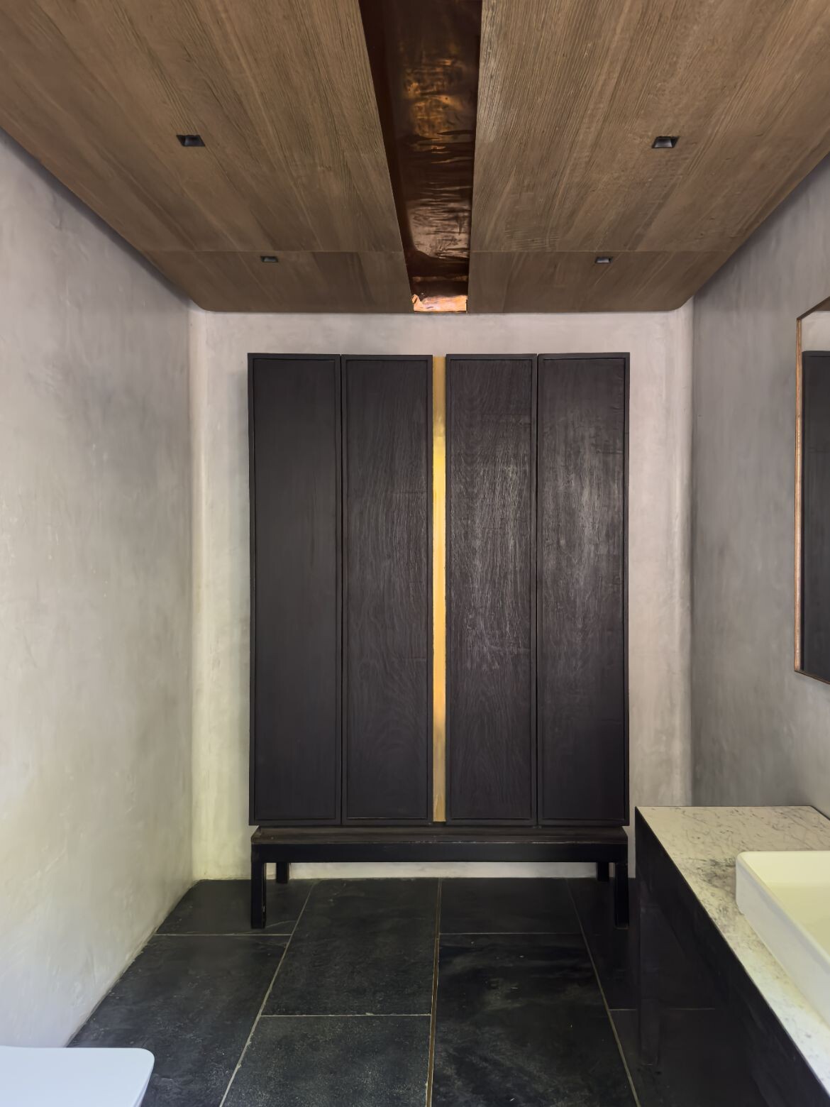
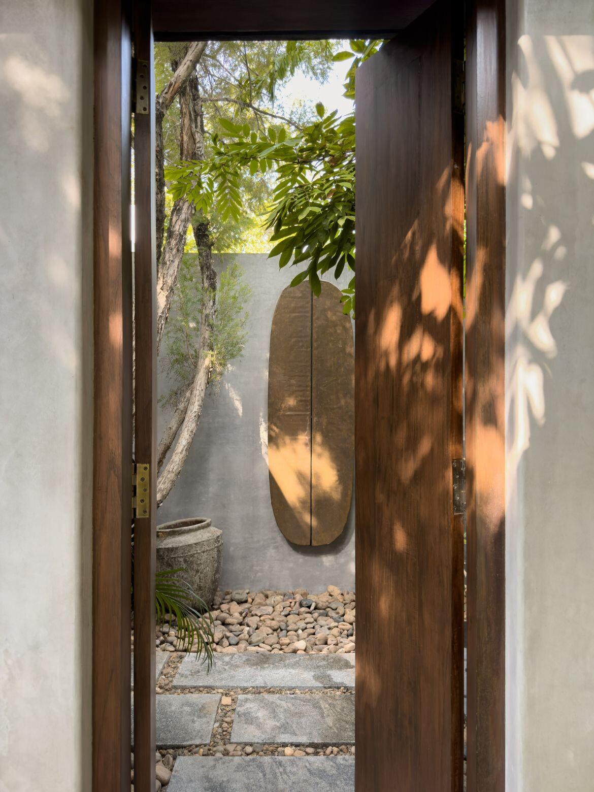
Arriving via a series of large pavers set in a bed of pebbles, the entry is articulated by a wide timber threshold and a slight step down. With a very slight nod to Balinese architecture, the entrance to the outdoor bathroom features a patinaed copper-clad wall installation in the shape of a shield while the linear entrance, in Indian teak, strengthens the whole.
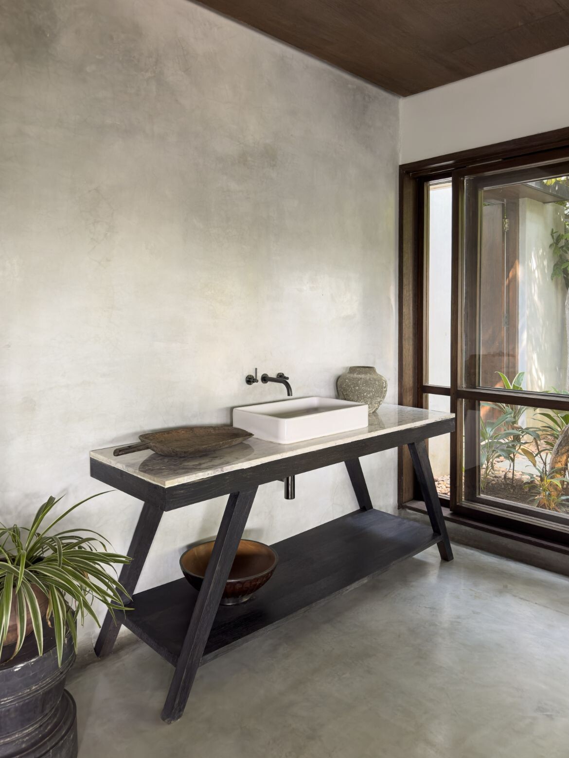
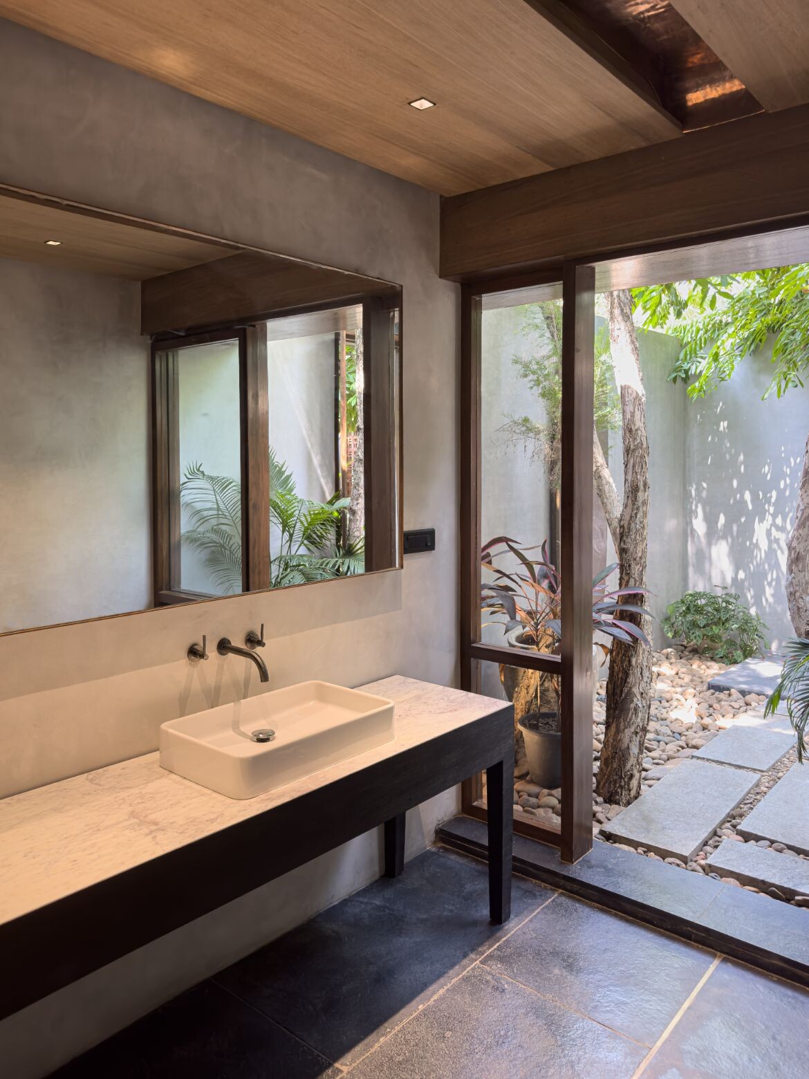
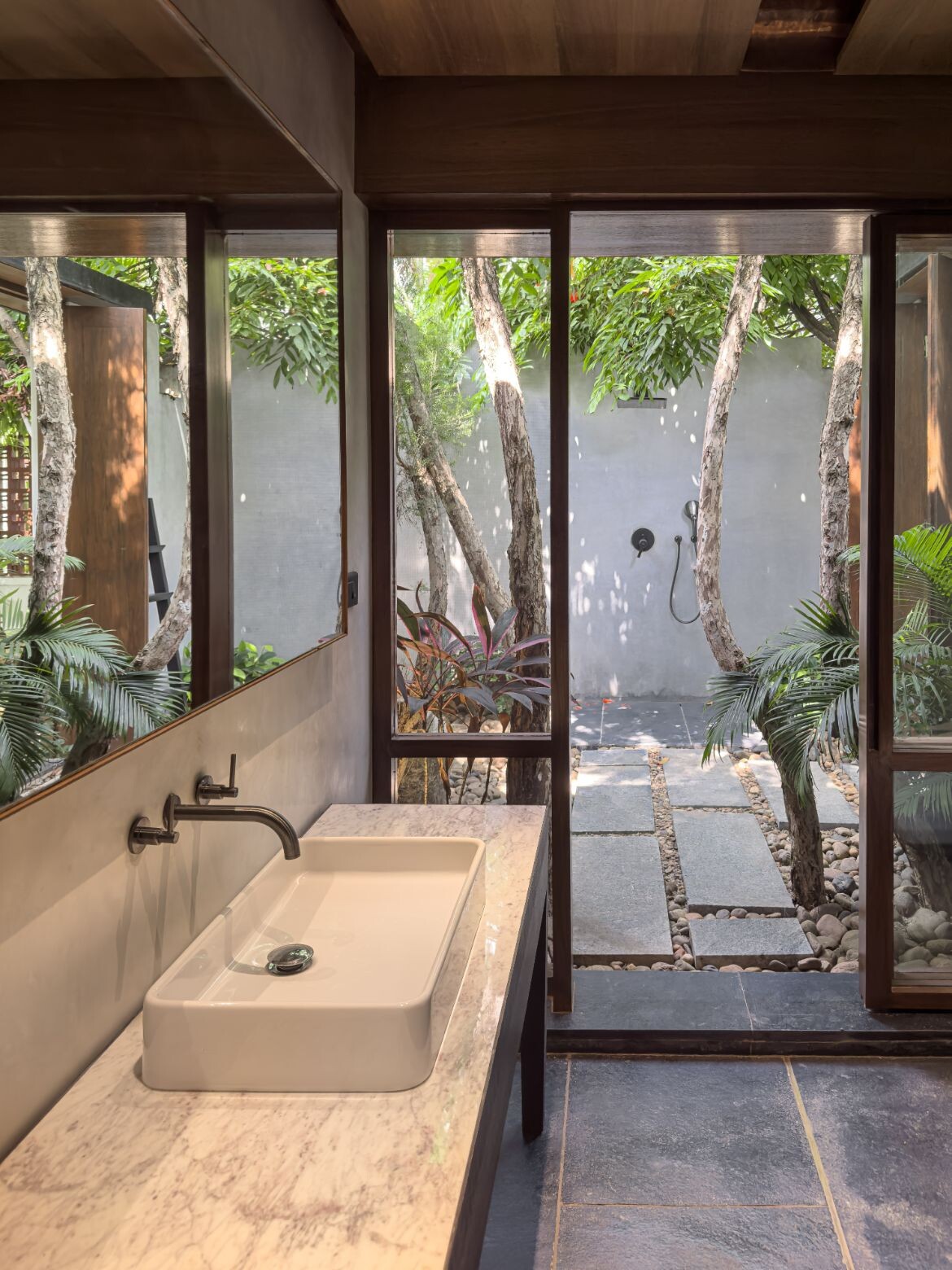
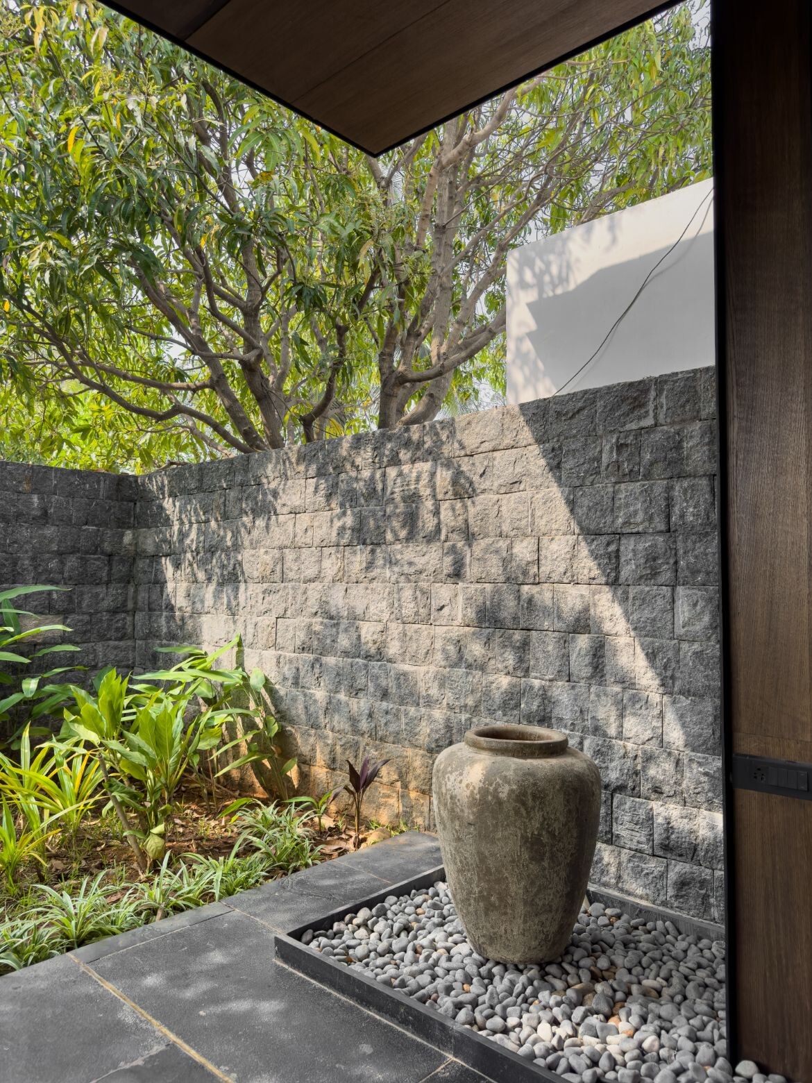
Designed to mesh with the outdoor landscape, the outdoor washroom has a subtle geometric design to the upper wall to allow an existing tree to continue its natural growth trajectory, while a border of pebbles softens the edge. This room also has a large indoor annexe for additional utility that continues the aesthetic via a black stained wood console with a white marble top, rectangular Toto basin and steel faucet from Grohe.
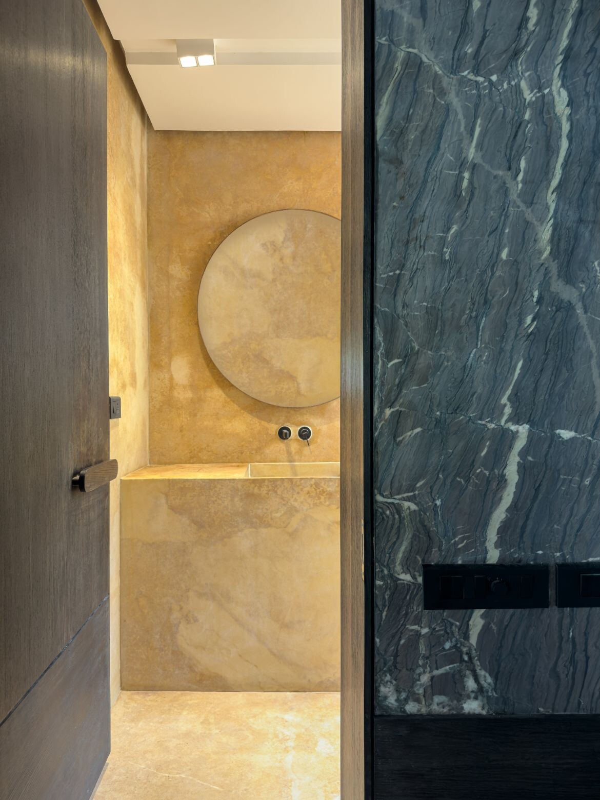
Sliding brass-edged glass doors are paired with large timber framed windows and wooden panelling to connect indoors with the outdoors. Along the long parameter, a roof line extends out over the area to create a room that is both outdoors and in. A Naga daybed (Northeast Indian timber bed, here used as a coffee table) from Phillips Antiques is paired with a pair of steel-trimmed Pinakin sofas in taupe.
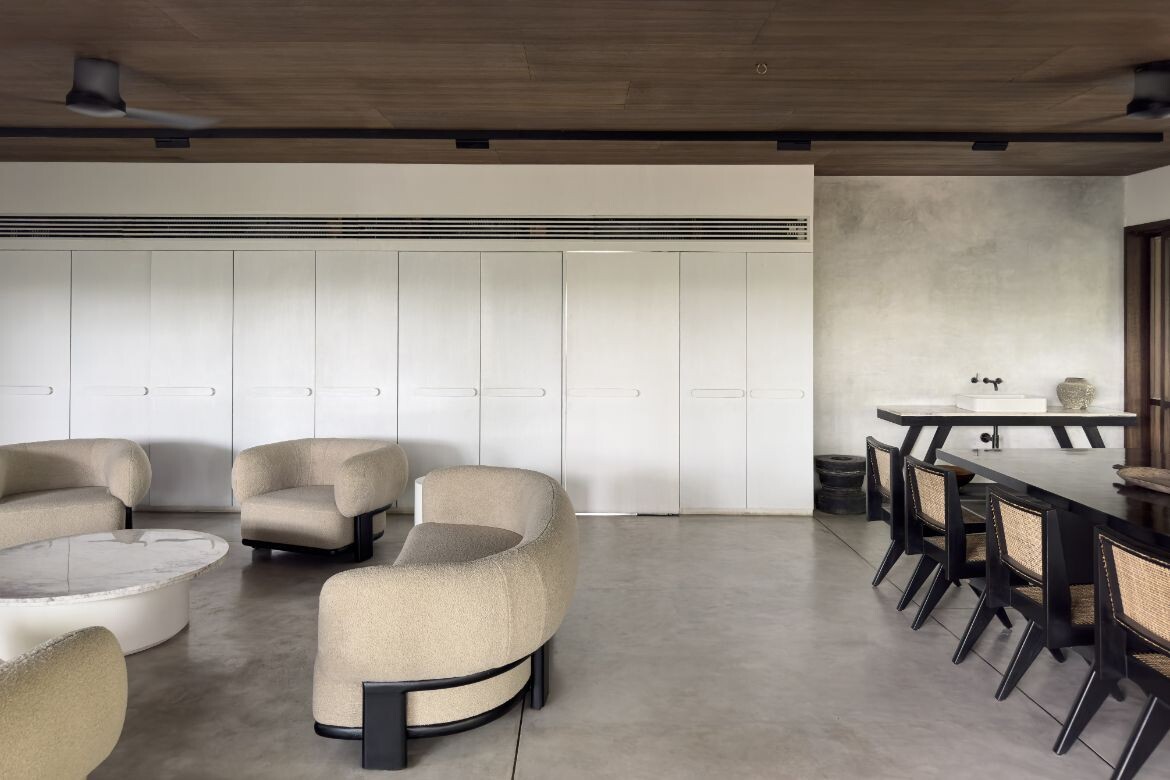
Configured as an open-plan living room, the central and main portion hosts a set of large boucle lounges (Pinakin). Curvaceous and comfortable, the tone is relaxed and easy. “The open floor plan, while encouraging togetherness, also allows the space to evolve and change over time to accommodate the different needs of the family,” says Lokesh.
The dining area is slightly more formal with a bespoke black lacquered dining table and antique Chandigarh rattan and black lacquer chairs from Phillips Antiques. That said, the remainder including side tables and cabinetry are bespoke. Running the length of these two areas, for example, is a custom expanse of white cabinetry with large white on white horizontal handles. One of these cupboards, however, is a doorway leading to the entirely concealed kitchen.
Named Wabi Sabi Pavilion in reference to the acceptance of transience and imperfection of traditional Japanese aesthetic philosophy, there is certainly the right feeling delivered through natural materiality and textiles. It is, however, the authentic age and presence inherent to the antiques seen throughout, that drive this principle home: “A curation of antiques from across the country derive beauty from their imperfections, adding to the wabi-sabi aesthetic,” says Lokesh.
182 Design
www.182design.com
We think you may also like Kanso House is a gentle home to relax in
Like what you just read? Similar articles below

Located on a busy street in Delhi, India, the architects, The Melange Studio, elected to design the upper floor of this home as a retreat and sanctuary from the outside bustle.

Transforming a brutalist space within Sherwood Towers into a light and colour filled kaleidoscope of excellence, SPARK has completed the conversion of a three-bedroom apartment as a showcase for the owners’ creative self-expression.